Introduction
Time-series analysis is a powerful way to predict events that occur at a future time. In this post I am going to be following up from three previous posts (Pt 1 –> https://rebrand.ly/l1tf4p1, Pt 2 -> https://rebrand.ly/zjgpw8v and Introduction to Time-Series –> https://rebrand.ly/z4lomwu). In Pt 2, I used a dummy dataset to show how to create an ARIMA model. However, that dataset does not reflect the typical dataset in the real world.
Retrieving the Time-Series Data
The first step is to load the data. The dataset we’ll be using in this post is from a public dataset from Walmart and we’ll follow the same steps as we did with the dummy dataset and a lot will be repeated from the last post. This data can be downloaded from https://www.kaggle.com/datasets/yasserh/walmart-dataset and covers a period from February 2010 to October 2012.
file_location <- 'ecommerce_data.csv'
# You can find it here:
# 'https://www.kaggle.com/datasets/yasserh/walmart-dataset'

sales_data_input <- read.csv(file_location)
Exploring the Time-Series Data
Let’s take a peak at the data:
head(sales_data_input) Store Date Weekly_Sales Holiday_Flag Temperature Fuel_Price CPI
1 1 05-02-2010 1643691 0 42.31 2.572 211.0964
2 1 12-02-2010 1641957 1 38.51 2.548 211.2422
3 1 19-02-2010 1611968 0 39.93 2.514 211.2891
4 1 26-02-2010 1409728 0 46.63 2.561 211.3196
5 1 05-03-2010 1554807 0 46.50 2.625 211.3501
6 1 12-03-2010 1439542 0 57.79 2.667 211.3806
Unemployment
1 8.106
2 8.106
3 8.106
4 8.106
5 8.106
6 8.106summary(sales_data_input) Store Date Weekly_Sales Holiday_Flag
Min. : 1 Length:6435 Min. : 209986 Min. :0.00000
1st Qu.:12 Class :character 1st Qu.: 553350 1st Qu.:0.00000
Median :23 Mode :character Median : 960746 Median :0.00000
Mean :23 Mean :1046965 Mean :0.06993
3rd Qu.:34 3rd Qu.:1420159 3rd Qu.:0.00000
Max. :45 Max. :3818686 Max. :1.00000
Temperature Fuel_Price CPI Unemployment
Min. : -2.06 Min. :2.472 Min. :126.1 Min. : 3.879
1st Qu.: 47.46 1st Qu.:2.933 1st Qu.:131.7 1st Qu.: 6.891
Median : 62.67 Median :3.445 Median :182.6 Median : 7.874
Mean : 60.66 Mean :3.359 Mean :171.6 Mean : 7.999
3rd Qu.: 74.94 3rd Qu.:3.735 3rd Qu.:212.7 3rd Qu.: 8.622
Max. :100.14 Max. :4.468 Max. :227.2 Max. :14.313 We can find the columns that we’re interested in for this analysis – Date, which is currently set as character data and Weekly_Sales. The Date column we’ll need to convert to a date column and the Weekly_Sales column we’ll round to whole numbers. I’ll keep it as weekly data, so we’ll have more periods and there might be weekly trends to analyze.
If this was a real-world analysis, we would go through a number of checks before proceeding (check that the dates are weekly and are the same day of the week, check the sales are correct from the source data, etc.).
# Load the packages we'll be using.
library(tidyverse)
library(lubridate)
library(forecast)
library(urca)
library(stats)
# Create new dataframe in case we need to rerun
# we won't have to reload the source file.
sales_data <- sales_data_input |>
dplyr::mutate(sales_date = lubridate::dmy(Date),
sales = round(Weekly_Sales, 0)) |>
dplyr::select(sales_date, sales)
head(sales_data) sales_date sales
1 2010-02-05 1643691
2 2010-02-12 1641957
3 2010-02-19 1611968
4 2010-02-26 1409728
5 2010-03-05 1554807
6 2010-03-12 1439542Now we have a dataframe with 6435 periods (weeks) of sales data. However, for time-series, you can’t use a dataframe as is – you need to transform it into a time-series variable. Also, you will need to provide the start date and the frequency. The frequency is typically 12 for monthly, 52 for weekly, etc. In our data, we have a start date of 2/5/2010 and a frequency of 52, since it is weekly:
# There are 142 periods from start = 2/5/2010 to end = 10/26/2012 (by week).
# We can also just use start = 1 and end = 142.
# However, then the model will not know that it is dates.

start_date <- as.Date(min(sales_data$sales_date))
end_date <- as.Date(max(sales_data$sales_date))

sales_data_ts <- ts(sales_data$sales,
                    start = c(year(start_date), week(start_date)),
                    end = c(year(end_date), week(end_date)), frequency = 52)
Now I can plot the data so far:
# We can plot the data to see visually what it looks like.
plot(sales_data_ts, xlab = "Week", ylab = "Sales")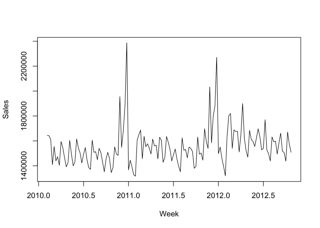
This is not as clear as the dummy dataset. But we can see a couple of clear spikes around the same time of year. It is not clear if there is any real trending or seasonality.
Unit Roots & the Augmented Dickey-Fuller Test
As discussed before, a unit root is a unit of measurement to help determine whether a time series dataset is stationary. Looking at the above graph, it is not clear that the dataset is not stationary. We’ll use the augmented Dickey-Fuller test to determine if the dataset is stationary. The ur.df() function in the urca package is how we’ll do it:
adf_test <- ur.df(sales_data_ts, type = 'trend', lags = 12)
summary(adf_test)
###############################################
# Augmented Dickey-Fuller Test Unit Root Test #
###############################################

Test regression trend


Call:
lm(formula = z.diff ~ z.lag.1 + 1 + tt + z.diff.lag)

Residuals:
    Min      1Q  Median      3Q     Max
-271959  -86674  -19641   56100  551500

Coefficients:
               Estimate Std. Error t value Pr(>|t|)
(Intercept)   1.056e+06  3.731e+05   2.831  0.00548 **
z.lag.1      -7.073e-01  2.527e-01  -2.799  0.00603 **
tt            6.176e+02  4.412e+02   1.400  0.16426
z.diff.lag1   5.328e-02  2.443e-01   0.218  0.82777
z.diff.lag2   7.445e-02  2.305e-01   0.323  0.74728
z.diff.lag3  -5.123e-02  2.211e-01  -0.232  0.81720
z.diff.lag4   3.287e-01  2.111e-01   1.557  0.12222
z.diff.lag5  -6.704e-02  1.985e-01  -0.338  0.73623
z.diff.lag6  -1.407e-01  1.880e-01  -0.749  0.45562
z.diff.lag7   5.816e-02  1.696e-01   0.343  0.73238
z.diff.lag8  -1.056e-01  1.513e-01  -0.698  0.48641
z.diff.lag9   4.228e-02  1.465e-01   0.289  0.77344
z.diff.lag10  2.135e-02  1.266e-01   0.169  0.86644
z.diff.lag11 -1.239e-01  1.115e-01  -1.112  0.26847
z.diff.lag12 -7.212e-03  9.415e-02  -0.077  0.93907
---
Signif. codes:  0 '***' 0.001 '**' 0.01 '*' 0.05 '.' 0.1 ' ' 1

Residual standard error: 144600 on 114 degrees of freedom
Multiple R-squared:  0.4904,    Adjusted R-squared:  0.4278
F-statistic: 7.835 on 14 and 114 DF,  p-value: 2.178e-11


Value of test-statistic is: -2.7985 2.7039 4.0261

Critical values for test statistics:
      1pct  5pct 10pct
tau3 -3.99 -3.43 -3.13
phi2  6.22  4.75  4.07
phi3  8.43  6.49  5.47
The most important piece of information is the “Value of test-statistic”, which in this case is -2.7985 for level of significance of 1%, 2.7985 for a level of significance of 5% and 4.0261 for a level of significance of 10%. To fully reject the NULL hypothesis, these vales should be greater than the tau3 critical values found below the “Value of test-statistic”. In this case, they are all greater than the critical values.
However, using different lags will return different results. For example, using a lag of 1 with this dataset will return test statistics that are less than the critical value at 1%, but greater than the critical values at 5% and 10%. That would lead to a marginal result where you would not be able to fully reject the NULL hypothesis.
Time-Series Decomposition
Now that we have loaded the data, updated it into what we want to work with, transformed it into a time-series object, graphed it, and tested for stationarity, we can now discuss time scales. As you can see from the above graph, there do not appear to be cyclical things happening on a weekly basis (no squiggles) as well as on an annual basis (no rising line).
The three types of time scales to think about:
- Long-Term Trend – The long-term direction of the data.
- Seasonality – Fixed intervals of fluctuations within the data.
- Residuals – Unexplained variation in the data not captured by the Long-Term Trend or Seasonality.
Moving Average with Time-Series
We can start with a moving average calculation. The point of a moving average is to understand the long-term trend of the data. We’ll add that as a line against the time-series line we plotted above. A moving average will use a few, consecutive values and average them for a given point.
For example, if we used three consecutive values and the sales were 5, 20, 30 and we centered the calculation around 20, then the moving average value for 20 would be 18.3. If the next value on the time-series after 30 was 56, so the time-series would go 5, 20, 30, 56; then the next moving average value would be for 30 and would average 20, 30, 56. The moving average value for 30 would then be 35.3.
# We are going to use five values to calculate the moving average.
ma_data <- forecast::ma(sales_data_ts, order = 5, centre = TRUE)

# Then graph the results.
plot(sales_data_ts, xlab = 'Week', ylab = 'Sales')
lines(ma_data, col = 'Red')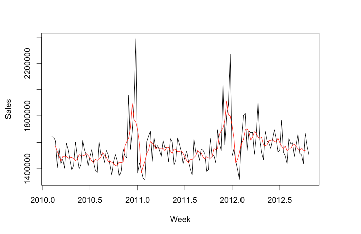
You can see how the MA line has been smoothed compared to the time-series line. Now if we want to just look at the seasonal component, we can plot the time-series divided by the MA (the MA can be subtracted instead, which is called the additive approach, as opposed to the multiplicative approach):
# Seasonal data - multiplicative approach.
seasonal_data <- sales_data_ts / ma_data
plot(seasonal_data, xlab = 'Week', ylab = 'Sales Multiplicative Variation')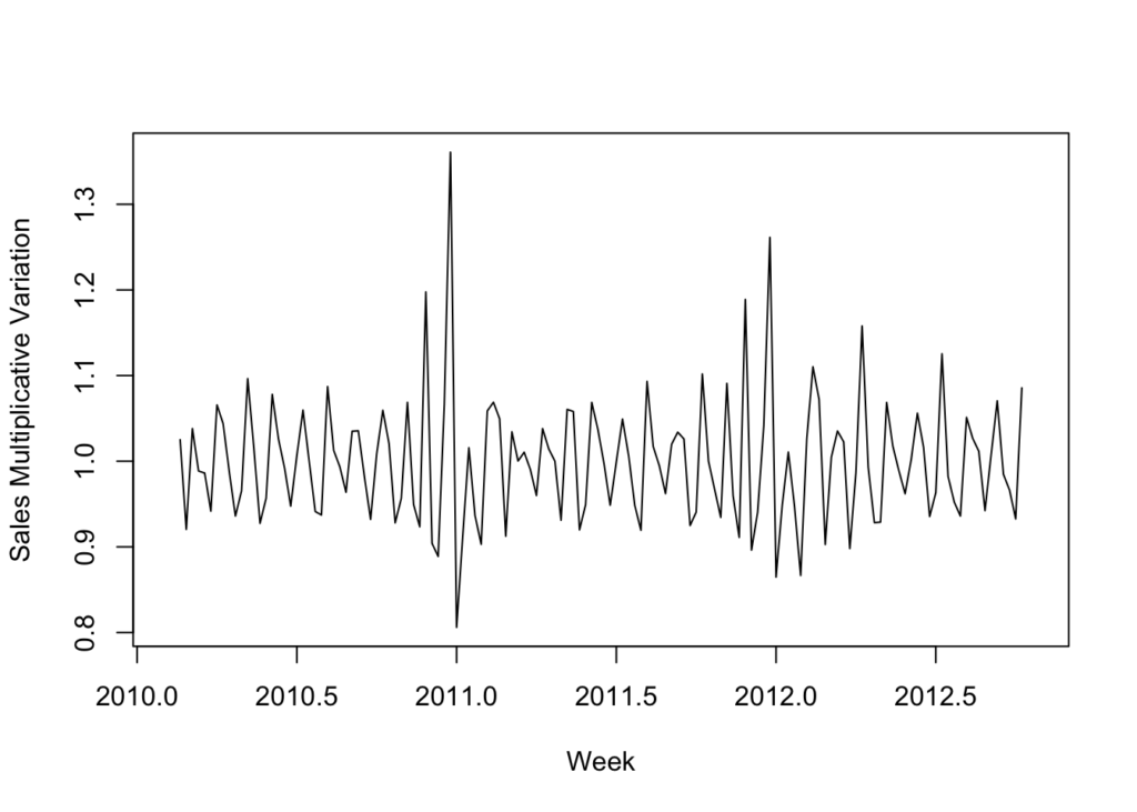
With this graph it appears that the seasonality is stagnate. There doesn’t appear to be any noticeable growth.
Now that we have explored the trend and the seasonality, we can use a function to view the time-series, trend, seasonality as well as the residuals:
# We're going to use the multiplicative decomposition.
# However, you can use type = 'additive' to use the additive instead.
sales_data_decomp <- decompose(sales_data_ts, type = 'multiplicative')
plot(sales_data_decomp, xlab = 'Week')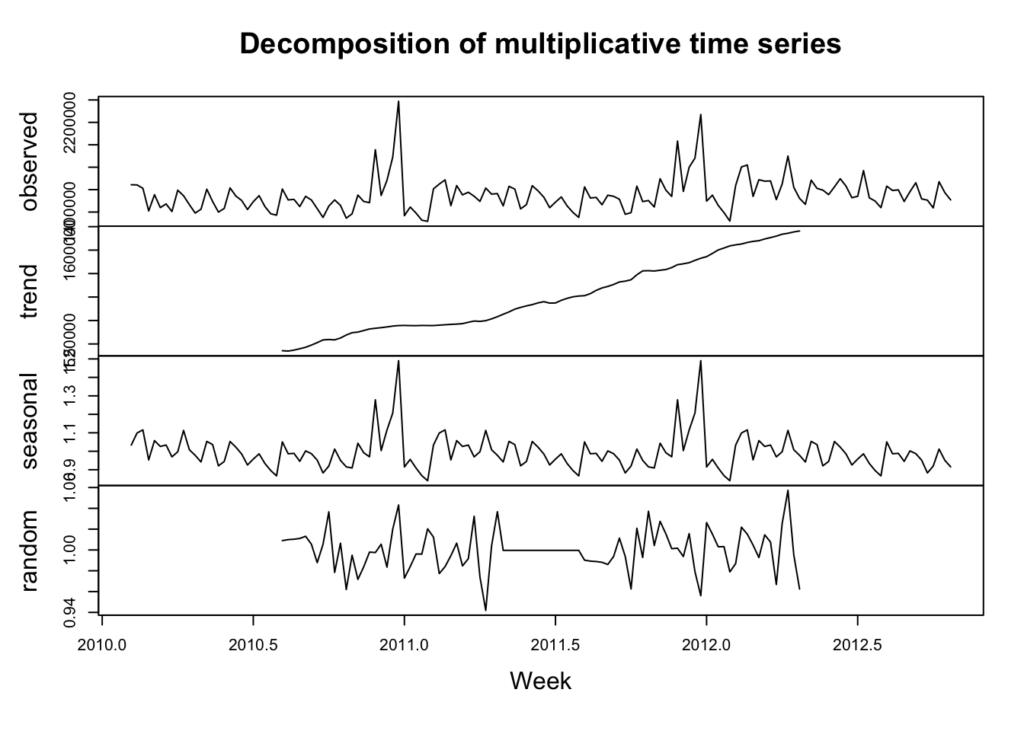
The calculations are done a little differently, but we can see the trend is sloping upwards and the seasonality is rather flat. Additionally, we can see the random or residuals, which is the variance in the data not explained by the long-term trend or the seasonality.
Autocorrelation & Lags
Autocorrelation is important in time series analysis because it provides insights into the underlying structure and behavior of the data. Positive autocorrelation suggests persistence or trend in the data, while negative autocorrelation suggests alternating patterns. Lack of autocorrelation indicates randomness or white noise. Lags are the number of periods to look back to calculate the autocorrelation.
stats::Box.test(sales_data_ts, lag = 52, type = "Ljung-Box")
    Box-Ljung test

data:  sales_data_ts
X-squared = 102.77, df = 52, p-value = 3.47e-05
In this data we see clearly there is positive autocorrelation because the X-squared value is positive and the p-value is very small.
We can also look at the data with various lags to see if there are any differences. Differences could indicate that the data is not stationary, that there is seasonality or trending (which we have tested previously).
lag.plot(sales_data_ts, lags = 6, do.line = FALSE)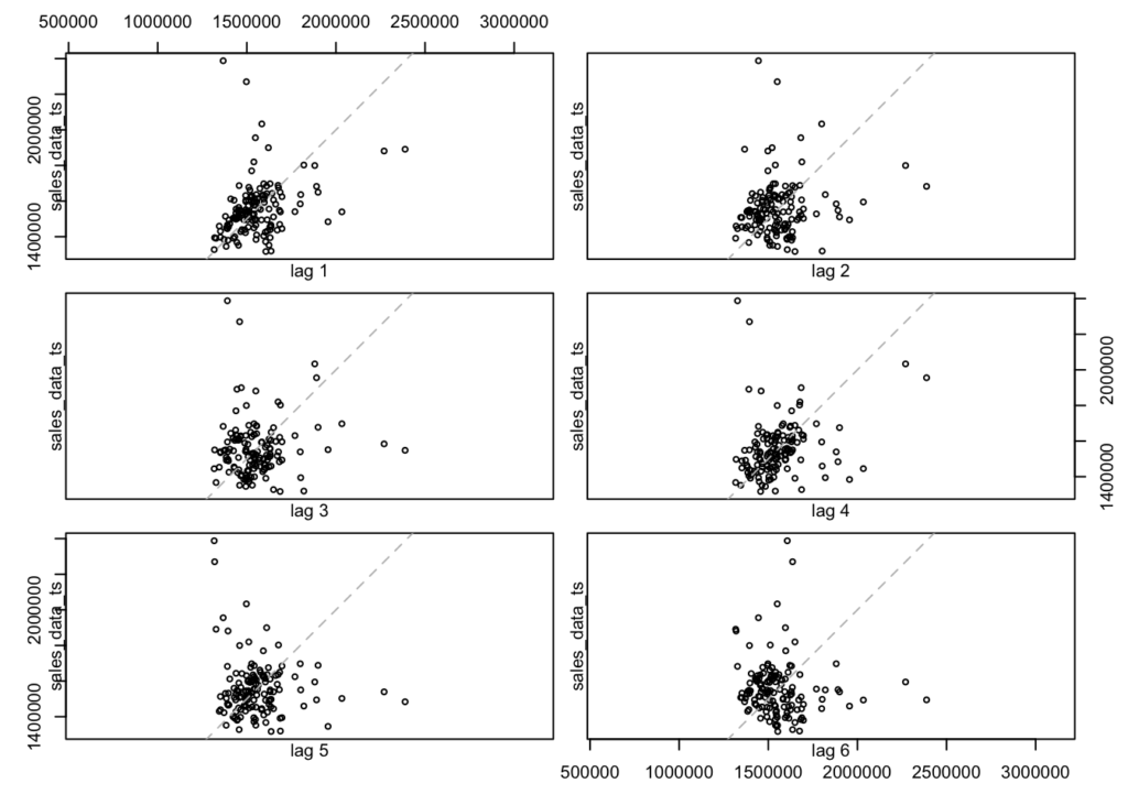
There does not appear to be a difference between lags. However, if I expand the look-back window to 52 periods then we can see some annual seasonality:
lag.plot(sales_data_ts, lags = 52, do.line = FALSE)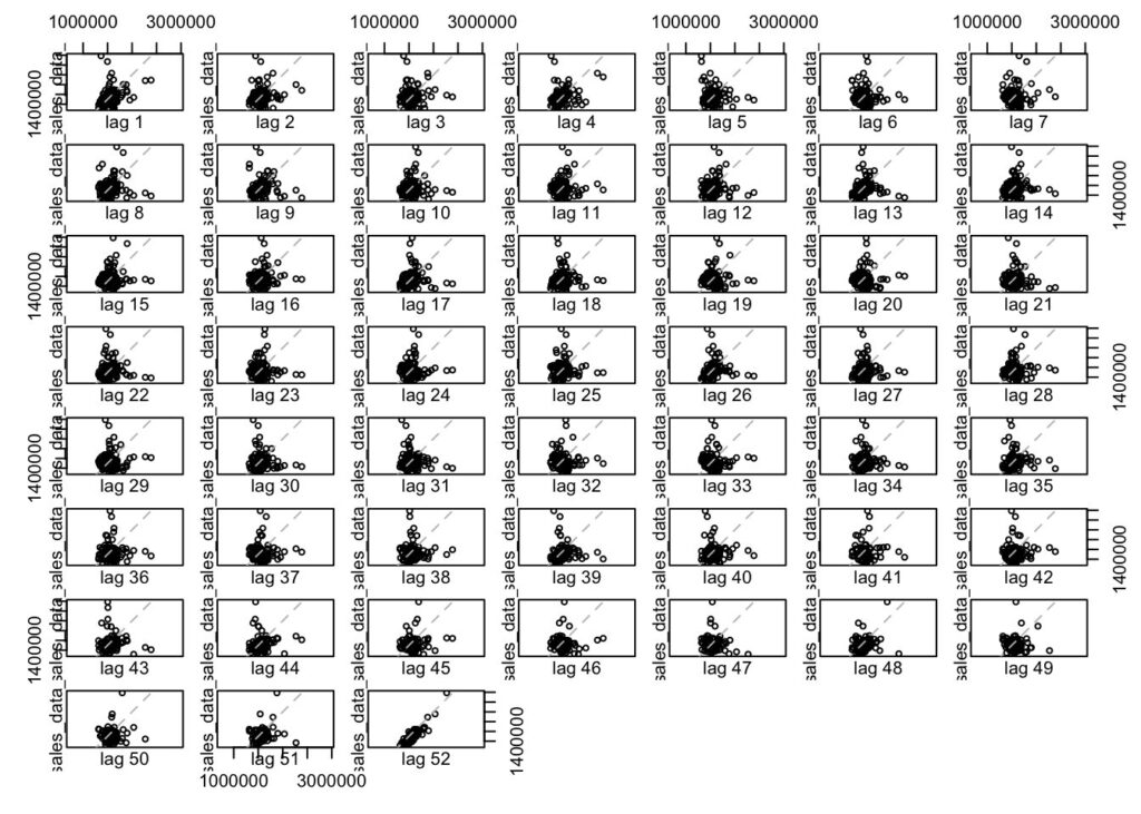
Autocorrelation Function (ACF)
We can use the ACF to check which lags are significant based on the correlation between a time series and its own lagged values at different time lags. More simply, ACF compares the current period’s value (sales, in this case) with the sales from the prior periods. ACF is useful in identifying white noise (or randomness) and stationarity.
forecast::Acf(sales_data_ts)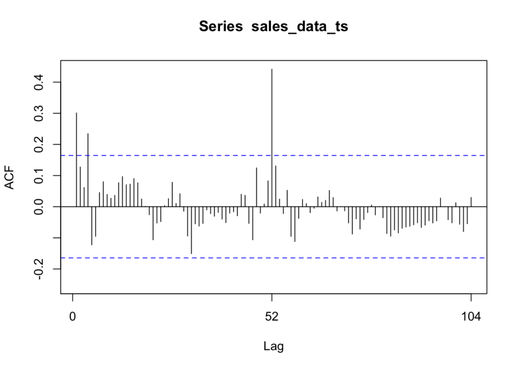
The vertical lines that go above and below the dotted horizontal lines are significant. If the data was white noise, then none of the vertical lines would go above or below the dotted horizontal lines. However, if the data is stationary, then the vertical lines would decline to zero rapidly.
If there are trends in the data, the vertical lines would decline slowly and taper off as the lags increase. Finally, if there is seasonality, the vertical lines would go above and below the dotted horizontal lines in a kind of pattern. There can be a mixture of stationary and seasonality in which the vertical lines will both decline slowly and taper off as the lags increase as well as demonstrate a kind of pattern.
In our Walmart data, we see that lags at 1, 4, and 52 are significant. We can also see a pattern in the vertical lines, indicating seasonality.
Partial Autocorrelation Function (PACF)
We can use this function to check which lags are significant by identifying the direct relationship between observations at different lags without the influence of the intervening lags. The PACF is more useful than the ACF when building an ARIMA model.
forecast::Pacf(sales_data_ts)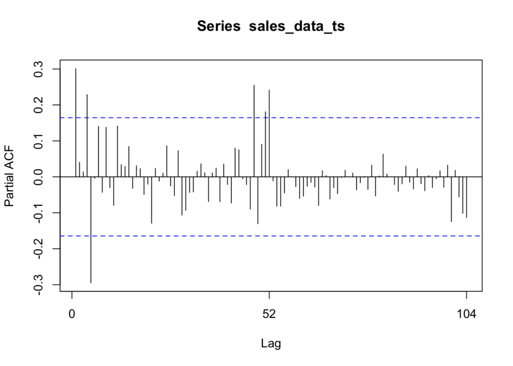
As you can see, there are six significant lags in the data. The lines at 1, 4, 5, 48, 51, and 52 are significant.
Assessing the patterns in both the ACF & PACF can help you to choose an appropriate ARIMA model to use for your data.
The following function pulls together the trend, ACF & PACF in one group chart:
forecast::tsdisplay(sales_data_ts) 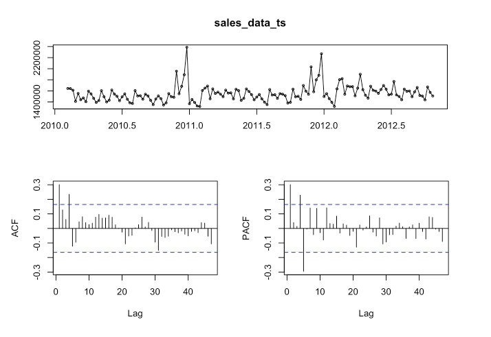
These are basically the steps that I covered it in Pt. 1 (I added a little more detail and did a few things a little differently). Next we are going to fit the model.
Fit the ARIMA Model
Use the auto.arima function to automatically select the best ARIMA model for your data based on Akaike Information Criterion (AIC), AICc or BIC value. The function conducts a search over possible model within the order constraints provided. Alternatively, you can manually specify the order of the ARIMA model with forecast::Arima(), but we will not go there in this post.
# Create the auto.arima model first.
arima_model <- forecast::auto.arima(sales_data_ts)

# Check for non-consecutive lag periods in the model---------------------------------
# Extract the coefficients of the AR terms
ar_terms <- arima_model$coef[grep("^ar", names(arima_model$coef))]

# Check if there are non-consecutive lags in the AR terms
non_consecutive_lags <- any(diff(as.numeric(gsub("ar", "", names(ar_terms)))) != 1)

if (non_consecutive_lags) {
  print("The model has chosen non-consecutive lags.")
} else {
  print("The model has not chosen non-consecutive lags.")
}
[1] "The model has not chosen non-consecutive lags."#-------------------------------------------------------------------------------------
# Use forecast to forecast the data.
forecast_arima <- forecast::forecast(arima_model, h = 24)
# Finally, plot the data.
plot(forecast_arima, xlab = 'Week', ylab = 'Sales')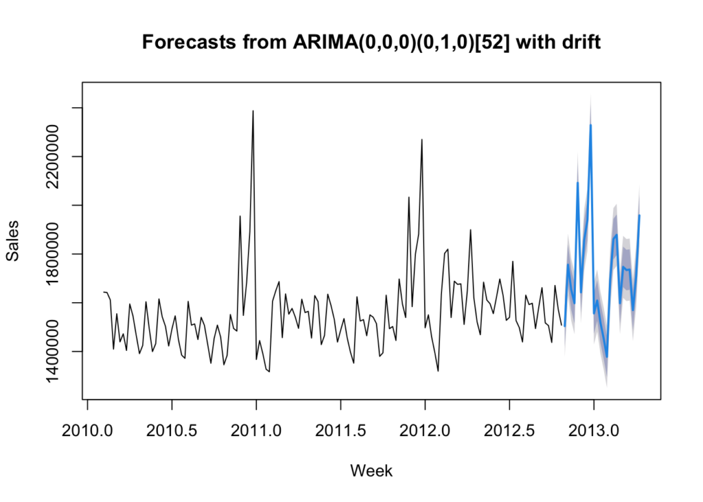
Reaching back to my blog post “Introduction of Time-series Analysis for Digital Analytics”, the notation at the top are the hyperparameters for the series. These are the autoregressive trend order (p), the difference trend order (d), and the moving average trend order (q). The notation would look like this: ARIMA(p,d,q).
Since there is seasonality, there are the seasonal autoregressive order (P), the seasonal difference order (D), the seasonal moving average order (Q) and the number of time steps for a single seasonal period (m). The notation for a seasonal ARIMA (SARIMA) would look like this: SARIMA(p,d,q)(P,D,Q)m.
In this case we have the following:
- p = 0 – No auto-regressive trend order
- d = 0 – No difference trend order
- q = 0 – No moving average order
- P = 0 – No seasonal auto-regressive order
- D = 1 – A seasonal difference order of 1
- Q = 0 – No seasonal moving average order
- m = 52 – time steps for a single seasonal period
- with drift = The model has a linear trend
All of this means that there is an annual seasonal component and a general trending upward that can be modeled.
Check Residuals
Examine the diagnostic plots and statistics of the ARIMA model to assess its adequacy. This step is crucial for verifying that the model assumptions are met and identifying any potential issues. Calculate accuracy measures such as Mean Absolute Error (MAE), Mean Squared Error (MSE), or others to evaluate the accuracy of the forecasts.
# Check residuals.
forecast::checkresiduals(arima_model)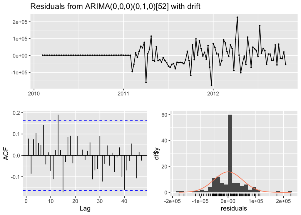
    Ljung-Box test

data:  Residuals from ARIMA(0,0,0)(0,1,0)[52] with drift
Q* = 30.719, df = 28, p-value = 0.3297

Model df: 0.   Total lags used: 28
The residuals from the checkresiduals() plot should look like white noise. It should not have any systematic pattern to it. The histogram and density plots of the residuals should follow a normal distribution. The ACF should not show any significant vertical lines. If there are some, then there still information that the model has not captured, which looks the case for our model since there are two vertical lines that appear significant.
Additionally, a Ljung-Box test is run to determine whether the autocorrelations of the residuals at different lags are statistically significant. With a p-value of 0.3297, it appears that there exists some autocorrelation in the residuals and more work could be done to better the model.
Check Accuracy
We are next going to run the accuracy() function to understand how accurate our model is compared to the data:
# Calculating accuracy.
forecast::accuracy(forecast_arima)
ME RMSE MAE MPE MAPE MASE
Training set 543.6658 51418.04 32481.43 -0.01978706 2.031512 0.4732963
ACF1
Training set 0.07871143This is what each value means:
The mean error (ME) is the average of the forecast errors – the residuals – calculated as the difference between the observed values and the forecast values. In this case our forecast is slightly low.
The root mean squared error (RMSE) is a measure of the average magnitude of the forecast errors and is expressed in the same units as the data. In this case, the average sales for the dataset is approximately $1,046,965 per week and the RMSE is $51,418 – about 5% off on average (plus or minus).
The mean absolute error (MAE) is the average of the absolute forecast errors. The lower, the better.
The mean percentage error (MPE) is the average of the percentage errors, calculated as the difference between the observed values and the forecasts divided by the observed values, multiplied by 100.
The mean absolute percentage error (MAPE) is the average of the absolute percentage errors. MAPE provides a measure of the average magnitude of the percentage errors, regardless of their direction.
The mean absolute scaled error (MASE) compares the forecast accuracy of a model to the forecast accuracy of a naive forecast (e.g., the random walk model).
And finally, ACF1 is the autocorrelation of the residuals at lag 1. It provides a measure of the correlation between consecutive residuals. In this case it is low at 0.07871143.
Summary
In this post we did the following steps with a real world dataset:
- Plotted the time-series
- Tested for unit roots
- Decomposed the time-series to understand the long-term trend, seasonality and residuals
- Calculated a moving average
- Calculated the seasonal component
- Created a multiplicative decomposition graph
- Reviewed autocorrelation and lags
- Ran the ACF & PACF functions
- Fit the ARIMA model with auto.arima()
- And finally, checked residuals & accuracy of the model
These step will help you to understand your data better and how accurate your ARIMA model is fitting as well as whether an ARIMA model is the appropriate model for the data you are trying to fit. As you can see, there is probably more work that can be done to make the model better. I would also advise trying other models to see how well they fit (like GARCH, DLM, or Prophet).

