
Introduction
Time-series analysis is a powerful way to predict events that occur at a future time. In this post I am going to be following up from two previous posts (Pt 1 –> https://rebrand.ly/l1tf4p1 and Introduction to Time-Series –> https://rebrand.ly/z4lomwu). Instead of R, this time I’m going to explore an ARIMA time-series analysis in Python. If you want to compare Python to R, https://rebrand.ly/zjgpw8v will take you to to the same analysis in R.
One thing you’ll notice is that it takes more lines of code in Python compared to R. In part, that is because R is a statistical programming language and was created for statistical work. Python is a general purpose language and is great at a number of things, but is not strictly designed for data analysis & modeling. That means it might not be quite as easy to get what you want out of it when you’re doing something like a time-series model.
One big thing I miss when coding in Python is R’s pipe feature (%>% or |>). If you are unfamiliar with this feature, it allows a series of functions to be strung together instead of having each on their own line or encapsulated in parenthesis. I find it to be a great help in writing & testing code.
Retrieving the Data
The first step is to load some data to work with. I am going to use a dummy sales dataset I have uploaded to my site. The sample data from Google Analytics I used previously was too small – it only covered a few months. This dummy data covers a period from January 2003 to December 2014. It is a CSV file and this is how it can be retrieved from a website:
import os
import pandas as pd
import requests
from io import StringIO

# URL of the CSV file
file_location = "https://daranondata.com/wp-content/uploads/2024/04/truck_sales.csv"

# Download the file content
response = requests.get(file_location, verify=False)  # Set verify=False if SSL issues persist
response.raise_for_status()  # Raise an error for bad status codes

# Load the content into a DataFrame
sales_data_input = pd.read_csv(StringIO(response.text))
Exploring the Data
Let’s take a peak at the sales data:
# Look at the data.
print(sales_data_input.head(5))
# Review the stats.
print(sales_data_input.describe())
Month-Year Number_Trucks_Sold
0 03-Jan 155
1 03-Feb 173
2 03-Mar 204
3 03-Apr 219
4 03-May 223
Number_Trucks_Sold
count 144.000000
mean 428.729167
std 188.633037
min 152.000000
25% 273.500000
50% 406.000000
75% 560.250000
max 958.000000This data has just the information we need for a time-series analysis in Python – month/year and number of trucks sold. A couple things about times-series – whatever time scale you want to use, it cannot have missing values. Also, you may have noticed that the Month.Year column is a character datatype and only includes the year and month. We’ll need to add a day to the year/month and change the column to a date datatype, if we want the model to recognize we’re using dates and what the time-scale is:
# Create new pandas dataframe in case we need to rerun
# we won't have to reload the source file.
sales_data = sales_data_input.copy()

# Convert "Month.Year" to a proper date format (it's currently in "YYYY-MM" format).
sales_data["sales_date"] = pd.to_datetime(sales_data["Month-Year"], format="%y-%b")

# Rename the column "Number_Trucks_Sold" to "sales".
sales_data = sales_data.rename(columns={'Number_Trucks_Sold': 'sales'})

# Select only the relevant columns.
sales_data = sales_data[["sales_date", "sales"]]

# Check the datatypes.
print(sales_data.dtypes)

# Check the data.
print(sales_data.head(5))
sales_date datetime64[ns]
sales int64
dtype: object
sales_date sales
0 2003-01-01 155
1 2003-02-01 173
2 2003-03-01 204
3 2003-04-01 219
4 2003-05-01 223Now we have a dataframe with 144 periods (months) of sales data. However, for time-series, you can’t use a dataframe as is – you need to transform it into a time-series variable. Also, you will need to provide the start date and the frequency. The frequency is typically 12 for monthly, 52 for weekly, etc. In our data, we have a start date of 1/1/2003 and a frequency of 12, since it is monthly:
# There are 144 periods from start = 1/1/2003 to end = 12/1/2014 (by month).
# We can also just use start = 1 and end = 144.
# However, then the model will not know that it is dates.

# Ensure data is sorted.
sales_data = sales_data.sort_values("sales_date")

# Create a time series with a DateTime index starting from January 2003.
sales_data_ts = pd.Series(
    sales_data["sales"].values,
    index=pd.date_range(start="2003-01", periods=len(sales_data), freq="MS")
)

# Display first few rows.
print(sales_data_ts.head())
2003-01-01 155
2003-02-01 173
2003-03-01 204
2003-04-01 219
2003-05-01 223
Freq: MS, dtype: int64Now I can plot the data so far:
import matplotlib.pyplot as plt

# We can plot the data to see visually what it looks like.
sales_data_ts.plot(figsize=(10, 5), xlabel="Month", ylabel="Sales", title="Sales Over Time")
plt.show()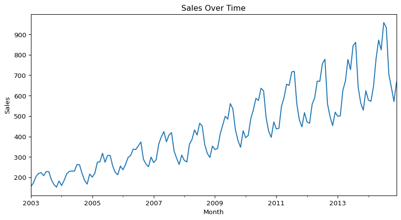
This shows a long-term trend, since the data is moving from the lower part of the graph on the left to the higher part on the right. There appears to be some seasonality as well, from the regular squiggles. The seasonal component is also growing in effect over time.
Unit Roots & the Augmented Dickey-Fuller Test
A unit root is a unit of measurement to help determine whether a time series dataset is stationary. Just looking at the above graph, it is clear that the dataset is not stationary, it is trending up. However, it’s not always this easy. There are statistical methods that calculate a unit root to determine if the dataset is stationary.
One of the most popular methods is using the augmented Dickey-Fuller test. To check for stationarity with the augmented Dickey-Fuller test we’ll use the adfuller function in the statsmodels.tsa.stattools sub-package:
# Load the adfuller module from the
# stattools sub-package.
from statsmodels.tsa.stattools import adfuller

# Perform the Augmented Dickey-Fuller test.
adf_test = adfuller(sales_data_ts, maxlag=12, regression="ct")  # 'ct' includes trend

# Extract values for the single test-statistic &
# the critical values at 1%, 5%, & 10%.
adf_statistic = adf_test[0]  # Test statistic
critical_values = adf_test[4]  # Dictionary of critical values

# Display results.
print(f"ADF Test Statistic: {adf_statistic}")
print(f"1% Critical Value: {critical_values['1%']}")
print(f"5% Critical Value: {critical_values['5%']}")
print(f"10% Critical Value: {critical_values['10%']}")
ADF Test Statistic: -1.740273872313581
1% Critical Value: -4.029593855484498
5% Critical Value: -3.444551229905729
10% Critical Value: -3.147026075968455The most important piece of information is the test statistic, which in this case is -1.7403. To fully reject the NULL hypothesis, this value should be greater than the critical values at 1%, 5%, & 10%. In this case, the test statistic is greater than each of the critical values. This is different than in R, where a different test statistic is calculated at each critical value. Python’s statsmodels ADF test, you get one test statistic, and you compare it to the critical values at 1%, 5%, and 10% to determine whether to reject the null hypothesis of a unit root (non-stationarity):
- If ADF Statistic < 1% Critical Value → Reject null hypothesis at 1% significance (strong evidence of stationarity).
- If ADF Statistic < 5% Critical Value → Reject at 5% significance (moderate evidence of stationarity).
- If ADF Statistic < 10% Critical Value → Reject at 10% significance (weak evidence of stationarity).
- If ADF Statistic is greater than all critical values → Fail to reject the null, meaning the time series likely has a unit root (i.e., it’s non-stationary).
However, using different lags will return different results. For example, using a lag of 1 with this dataset will return test statistics that are less than the critical value at 1%, but greater than the critical values at 5% and 10%. That would lead to a marginal result where you would not be able to fully reject the NULL hypothesis.
Time-Series Decomposition
Now that we have loaded the data, updated it into what we want to work with, transformed it into a time-series Python object, graphed it, and tested for stationarity, we can now discuss time scales. As you can see from the above graph, there are cyclical things happening on a monthly basis (the squiggles) as well as on an annual basis (the overall rising squiggly line).
The three types of time scales to think about:
- Long-Term Trend – The long-term direction of the data.
- Seasonality – Fixed intervals of fluctuations within the data.
- Residuals – Unexplained variation in the data not captured by the Long-Term Trend or Seasonality.
Moving Average
We can start with a moving average calculation. The point of a moving average is to understand the long-term trend of the data. We’ll add that as a line against the time-series line we plotted above. A moving average will use a few, consecutive values and average them for a given point.
For example, if we used three consecutive values and the sales were 5, 20, 30 and we centered the calculation around 20, then the moving average value for 20 would be 18.3. If the next value on the time-series after 30 was 56, so the time-series would go 5, 20, 30, 56; then the next moving average value would be for 30 and would average 20, 30, 56. The moving average value for 30 would then be 35.3.
# Compute the 5-period moving average (centered)
ma_data = sales_data_ts.rolling(window=5, center=True).mean()

# Plot the original sales data
plt.figure(figsize=(10, 5))
plt.plot(sales_data_ts, label="Original Sales", marker='o', linestyle='-', color='blue')

# Plot the moving average
plt.plot(ma_data, label="5-Period Moving Average", color='red', linewidth=2)

# Add labels and title
plt.xlabel("Month")
plt.ylabel("Sales")
plt.title("Sales Data with Moving Average")
plt.legend()

# Rotate x-axis labels for better readability
plt.xticks(rotation=45)

# Show the plot
plt.show()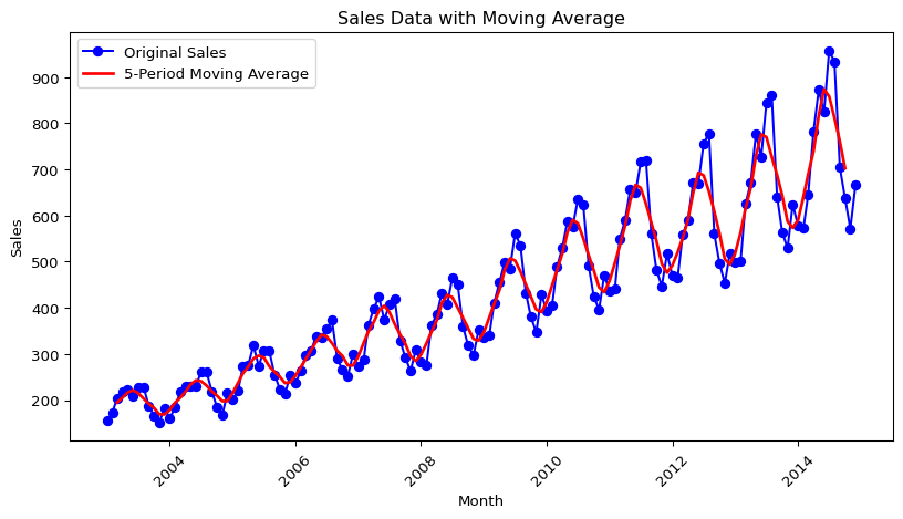
There is obviously very strong seasonal component, but you can see how the MA line has been smoothed compared to the time-series line. Now if we want to just look at the seasonal component, we can plot the time-series divided by the MA (the MA can be subtracted instead, but since the seasonal component is growing over time, division is likely better. This is called the multiplicative approach, as opposed to the additive approach.):
# Seasonal data - multiplicative approach.
seasonal_data = sales_data_ts / ma_data

# Plotting the seasonal data
plt.plot(seasonal_data)
plt.xlabel('Month')
plt.ylabel('Sales Multiplicative Variation')
plt.show()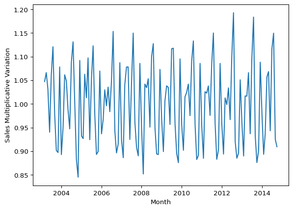
With this graph you can see that the seasonality grows, but it is in proportion to the level of the series. In other words, as the trend turns upward, so does the seasonality.
Now that we have explored the trend and the seasonality, we can use a function to view the time-series, trend, seasonality as well as the residuals:
# Load the seasonal_decompose module from the
# seasonal sub-package.
from statsmodels.tsa.seasonal import seasonal_decompose

# We're going to use the multiplicative decomposition.
# However, you can use type = 'additive' to use the additive instead.
# Set period based on your data (e.g., 12 for monthly data)
sales_data_decomp = seasonal_decompose(sales_data_ts, model='multiplicative', period=12)

# Plotting the decomposition
sales_data_decomp.plot()
plt.xlabel('Month')
plt.show()
The calculations are done a little differently, but we can see the trend is sloping upwards and the seasonality is consistent in relationship to the trend. Additionally, we can see the random or residuals, which is the variance in the data not explained by the long-term trend or the seasonality.
Autocorrelation & Lags
Autocorrelation is important in time-series analysis in Python (or R) because it provides insights into the underlying structure and behavior of the data. Positive autocorrelation suggests persistence or trend in the data, while negative autocorrelation suggests alternating patterns. Lack of autocorrelation indicates randomness or white noise. Lags are the number of periods to look back to calculate the autocorrelation.
# Load the acorr_ljungbox function within the diagnostic module
# of the statsmodels.stats sub-package -
# it performs the Ljung-Box test for autocorrelation.
from statsmodels.stats.diagnostic import acorr_ljungbox

# Run the Ljung-Box test with lag = 12
ljung_box_test = acorr_ljungbox(sales_data_ts, lags=[12], boxpierce=False)

# Extract and print results
print(f"Ljung-Box Test Statistic (X-squared): {ljung_box_test['lb_stat'].iloc[0]}")
print(f"P-Value: {ljung_box_test['lb_pvalue'].iloc[0]}")
Ljung-Box Test Statistic (X-squared): 929.5034121429239
P-Value: 2.645511967589147e-191In this data we see clearly there is positive autocorrelation because the X-squared value is positive and the p-value is very small.
We can also look at the data with various lags to see if there are any differences. Differences could indicate that the data is not stationary, that there is seasonality or trending (which we have tested previously).
# Create a lag plot for 6 lags
fig, axes = plt.subplots(2, 3, figsize=(15, 10))  # Create a 2x3 grid for 6 lags
axes = axes.flatten()

for lag in range(1, 7):  # Loop through lags from 1 to 6
    axes[lag-1].scatter(sales_data_ts[:-lag], sales_data_ts[lag:], alpha=0.5)
    axes[lag-1].set_title(f'Lag {lag}')
    axes[lag-1].set_xlabel(f'Lag {lag} Value')
    axes[lag-1].set_ylabel('Current Value')

plt.tight_layout()
plt.show()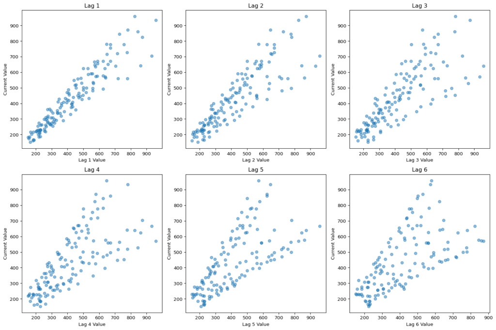
There is definitely a difference between lags. If I expand the look-back window to 24 periods then we can see some annual seasonality, which, given the plot above with the sales spikes, is not surprising:
# Create a lag plot for 24 lags with a more readable layout
fig, axes = plt.subplots(9, 3, figsize=(25, 15))  # 9x3 grid for 24 lags
axes = axes.flatten()

for lag in range(1, 25):  # Loop through lags from 1 to 24
    axes[lag-1].scatter(sales_data_ts[:-lag], sales_data_ts[lag:], alpha=0.5)
    axes[lag-1].set_title(f'Lag {lag}', fontsize=12)
    axes[lag-1].set_xlabel(f'Lag {lag} Value', fontsize=8)
    axes[lag-1].set_ylabel('Current Value', fontsize=8)

# Remove any unused subplots if there are fewer than 24
for i in range(24, len(axes)):
    fig.delaxes(axes[i])

plt.tight_layout()
plt.show()
Autocorrelation Function (ACF)
We can use the ACF to check which lags are significant based on the correlation between a time series and its own lagged values at different time lags. More simply, ACF compares the current period’s value (sales, in this case) with the sales from the prior periods. ACF is useful in identifying white noise (or randomness) and stationarity.
import numpy as np
import matplotlib.pyplot as plt
from statsmodels.tsa.stattools import acf

# Get the number of samples.
n = len(sales_data_ts)

# Compute ACF values
acf_values, confint = acf(sales_data_ts, nlags=40, alpha=0.05)

# Plot ACF
plt.bar(range(len(acf_values)), acf_values, width=0.3, color='blue', label='ACF')

# Add straight significance lines at ±1.96 / sqrt(n)
conf_level = 1.96 / np.sqrt(n)
plt.axhline(y=conf_level, color='red', linestyle='dashed', label="95% Conf. Level")
plt.axhline(y=-conf_level, color='red', linestyle='dashed')

plt.xlabel("Lag")
plt.ylabel("Autocorrelation")
plt.title("Autocorrelation Function (ACF)")
plt.legend()
plt.show()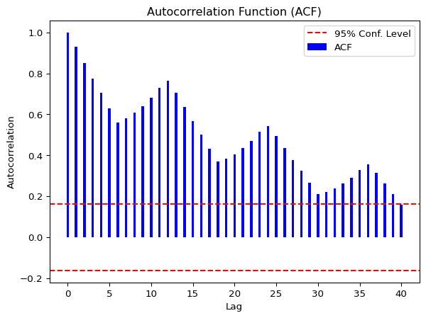
The lines that go above and below the red dotted horizontal lines are significant. If the data was white noise, then none of the vertical lines would go above or below the dotted horizontal lines. One the other hand, if the data is stationary, then the vertical lines would decline to zero rapidly.
If there are trends in the data, the vertical lines would decline slowly and taper off as the lags increase. Finally, if there is seasonality, the vertical lines would go above and below the dotted horizontal lines in a kind of pattern. There can be a mixture of stationary and seasonality in which the vertical lines will both decline slowly and taper off as the lags increase as well as demonstrate a kind of pattern.
In our dummy data, we see that all the lags are significant. We can also see a pattern in the vertical lines, indicating seasonality. If we look at the curved significance line that uses Bartlett’s formula for confidence, we see that not all the lags are significant – only the first 15 or so. This illustrates the difference between different formulas between time-series analysis in Python and R for the same calculation – significance of lags. Whcih is right? Well, it depends. If you assume pure white noise (no autocorrelation at any lag), the fixed lines are fine. However, if your data does have autocorrelation (measure of how a time series is related to lagged versions of itself), the Bartlett-adjusted confidence intervals are more appropriate.
Partial Autocorrelation Function (PACF)
We can use this function to check which lags are significant by identifying the direct relationship between observations at different lags without the influence of the intervening lags. The PACF is more useful than the ACF when building an ARIMA model.
from statsmodels.graphics.tsaplots import plot_pacf

# Assuming sales_data_ts is a pandas Series
plt.figure(figsize=(8, 6))

# Plotting the partial autocorrelation function
plot_pacf(sales_data_ts, lags=40)  # You can adjust lags as needed

# Display the plot
plt.show()
<Figure size 768x576 with 0 Axes>
As you can see, there are four significant lags in the data. The lines at 1, 7, 10 & 13 are significant.
Assessing the patterns in both the ACF & PACF can help you to choose an appropriate ARIMA model to use for your data.
For this time-series analysis in Python, the following function pulls together the trend, ACF & PACF in one group chart (I use the Bartlett-adjusted confidence intervals in the ACF chart instead of a fixed confidence interval to show the difference), which is a little different than in R:
from statsmodels.graphics.tsaplots import plot_acf, plot_pacf

# Assuming sales_data_ts is a pandas Series
plt.figure(figsize=(12, 8))

# 1. Plot the time series
plt.subplot(3, 1, 1)
plt.plot(sales_data_ts)
plt.title('Time Series')
plt.xlabel('Time')
plt.ylabel('Sales')

# 2. Plot the Autocorrelation Function (ACF)
plt.subplot(3, 1, 2)
plot_acf(sales_data_ts, lags=40, ax=plt.gca())  # Use the current axis for the ACF plot

# 3. Plot the Partial Autocorrelation Function (PACF)
plt.subplot(3, 1, 3)
plot_pacf(sales_data_ts, lags=40, ax=plt.gca())  # Use the current axis for the PACF plot

# Display the plots
plt.tight_layout()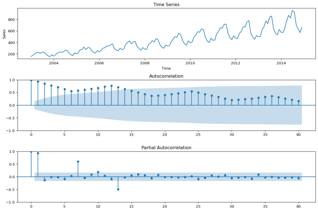
These are basically the steps that I covered it in Pt. 1 (I added a little more detail and did a few things a little differently). Next we are going to fit the model.
Fit the ARIMA Model
Use the auto.arima function to automatically select the best ARIMA model for your data based on Akaike Information Criterion (AIC), AICc or BIC value. The function conducts a search over possible model within the order constraints provided. Alternatively, you can manually specify the order of the ARIMA model with forecast::Arima(), but we will not go there in this post.
import warnings

# Suppress specific warnings
warnings.filterwarnings("ignore", category=UserWarning, module="statsmodels")
warnings.filterwarnings("ignore", category=FutureWarning)

import statsmodels.api as sm
from statsmodels.tsa.arima.model import ARIMA

# Ensure sales_data_ts is a pandas Series with a proper DateTime index
sales_data_ts.index = pd.date_range(start='2000-01', periods=len(sales_data_ts), freq='ME')  # Adjust start date as needed

# Fit ARIMA model
arima_model = ARIMA(sales_data_ts, order=(2,1,1), seasonal_order=(0,1,0,12))  # Matches R model
arima_fit = arima_model.fit()

# Forecast the next 24 periods
forecast = arima_fit.get_forecast(steps=24)
forecast_index = pd.date_range(start=sales_data_ts.index[-1], periods=25, freq='M')[1:]  # Match actual time period
predicted_values = forecast.predicted_mean
conf_int = forecast.conf_int()

# Set dark background for R-style look
#plt.style.use('dark_background')

# Plot original data and forecast
plt.figure(figsize=(12, 6))
plt.plot(sales_data_ts, label='Past Sales', color='lightblue')
plt.plot(forecast_index, predicted_values, label='Forecasted Sales', color='red')
plt.fill_between(forecast_index, conf_int.iloc[:, 0], conf_int.iloc[:, 1], color='gray', alpha=0.3, label='Confidence Interval')

plt.xlabel('Month', fontsize=12, color='white')
plt.ylabel('Sales', fontsize=12, color='white')
plt.title('Sales Forecast Using ARIMA', fontsize=14, color='white')

# Improve legend visibility
legend = plt.legend()
for text in legend.get_texts():
    text.set_color('white')

plt.grid(color='gray', linestyle='--', linewidth=0.5)
plt.show()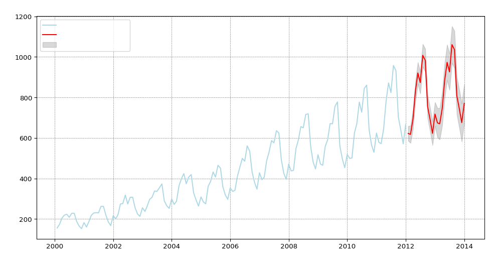
Reaching back to my blog post “Introduction of Time-series Analysis for Digital Analytics”, the notation at the top are the hyperparameters for the series. These are the autoregressive trend order (p), the difference trend order (d), and the moving average trend order (q). The notation would look like this: ARIMA(p,d,q).
Since there is seasonality, there are the seasonal autoregressive order (P), the seasonal difference order (D), the seasonal moving average order (Q) and the number of time steps for a single seasonal period (m). The notation for a seasonal ARIMA (SARIMA) would look like this: SARIMA(p,d,q)(P,D,Q)m.
In this case we have the following:
- p = 2 Auto-regressive trend order of 2
- d = 1 difference trend order of 1
- q = 1 moving average order of 1
- P = 0 No seasonal auto-regressive order
- D = 1 A seasonal difference order of 1
- Q = 0 No seasonal moving average order
- m = 12 time steps for a single seasonal period
Check Residuals & Accuracy
Next step in this time-series analysis in Python is to examine the diagnostic plots and statistics of the ARIMA model. This step is crucial for verifying that the model assumptions are met and identifying any potential issues. We need to calculate the following:
- Mean Absolute Error (MAE)
- Mean Absolute Percentage Error (MAPE)
- Root Mean Squared Error (RMSE)
# Perform residual diagnostics
residuals = arima_fit.resid

# Plot residuals
fig, axes = plt.subplots(3, 1, figsize=(10, 8))

# 1. Residuals Time Series Plot
axes[0].plot(residuals, label='Residuals', color='blue')
axes[0].axhline(y=0, linestyle='--', color='gray')
axes[0].set_title('Residuals Over Time')
axes[0].legend()

# 2. Histogram of Residuals
axes[1].hist(residuals, bins=20, edgecolor='black', color='blue', alpha=0.7)
axes[1].set_title('Histogram of Residuals')

# 3. ACF Plot (Autocorrelation of Residuals)
sm.graphics.tsa.plot_acf(residuals, lags=24, ax=axes[2])
axes[2].set_title('Autocorrelation of Residuals')

plt.tight_layout()
plt.show()

# Perform Ljung-Box test for autocorrelation in residuals
ljung_box_test = sm.stats.acorr_ljungbox(residuals, lags=[10], return_df=True)
print("Ljung-Box test results:\n", ljung_box_test)
Ljung-Box test results:
     lb_stat  lb_pvalue
10  5.96866   0.817889
The residuals from the checkresiduals() plot should look like white noise. It should not have any systematic pattern to it. The histogram and density plots of the residuals should follow a normal distribution. The ACF should not show any significant vertical lines. If there are some, then there still information that the model has not captured, which looks the case for our model since there are two vertical lines that appear significant.
Additionally, a Ljung-Box test is run to determine whether the autocorrelations of the residuals at different lags are statistically significant. With a p-value of 0.817889, it appears that there does not exist some autocorrelation in the residuals. This is a little different result than in the R version, where a little autocorrelation existed. This is due again to slightly different ways of calculating significance and once again shows that this is part art, part science.
We are next going to run the accuracy() function to understand how accurate our model is compared to the data. Unlike in R, in Python this has to be done a little more manually and we’re going to return a few less values:
from sklearn.metrics import mean_absolute_error, mean_squared_error, mean_absolute_percentage_error
import numpy as np

# Python does not have a function to evaluate the forecast
# based on historical data, however, we can use 2013 & 2014
# data to simulate the accuracy of the prediction.

# Get the first date in the dataframe.
first_date = sales_data['sales_date'].iloc[0]

# This is how you would get the last date, if
# you're interested.
#last_date = sales_data['sales_date'].iloc[-1]

# Create a date range w/o hard-coding dates
# since I loathe that practice - using the first date variable from above
# and the len() of the series.
dates = pd.date_range(start=first_date, periods=len(sales_data_ts), freq='ME')

# Add the date range as an index - ensure you use .values or
# the series will just return NaN for sales.
actual_values = pd.Series(sales_data_ts.values, index=dates)

# Limit to dates in 2013 & 2014.
actual = actual_values['2013':'2014']

# Show the filtered data
print(actual)

# Calculate forecast accuracy metrics
mae = mean_absolute_error(actual, predicted_values)
rmse = np.sqrt(mean_squared_error(actual, predicted_values))
mape = mean_absolute_percentage_error(actual, predicted_values)

# Print accuracy metrics
print(f"Mean Absolute Error (MAE): {mae}")
print(f"Root Mean Squared Error (RMSE): {rmse}")
print(f"Mean Absolute Percentage Error (MAPE): {mape}")
2013-01-31 499
2013-02-28 501
2013-03-31 625
2013-04-30 671
2013-05-31 777
2013-06-30 727
2013-07-31 844
2013-08-31 861
2013-09-30 641
2013-10-31 564
2013-11-30 529
2013-12-31 624
2014-01-31 578
2014-02-28 572
2014-03-31 646
2014-04-30 781
2014-05-31 872
2014-06-30 824
2014-07-31 958
2014-08-31 933
2014-09-30 704
2014-10-31 639
2014-11-30 571
2014-12-31 666
Freq: ME, dtype: int64
Mean Absolute Error (MAE): 112.18080568153486
Root Mean Squared Error (RMSE): 114.28569659470202
Mean Absolute Percentage Error (MAPE): 0.16696018555148853This is what each value means:
The mean absolute error (MAE) is the average of the absolute forecast errors. The lower, the better.
The root mean squared error (RMSE) is a measure of the average magnitude of the forecast errors and is expressed in the same units as the data. In this case, the average sales for the dataset is approximately 428 and the RMSE is 17.6 units above – about 4% off.
The mean absolute percentage error (MAPE) is the average of the absolute percentage errors. MAPE provides a measure of the average magnitude of the percentage errors, regardless of their direction.
Summary
There are definitely some differences between doing time-series analysis in Python versus R. I like that in Python, it gives you the Bartlett’s formula for confidence for ACF instead of a fixed confidence as a default. However, I found that a number of steps were a little trickier in Python. It’s possible that there are other packages (or future packages) that may make this easier. I found that both languages are solid at analyzing and modeling the data. I think personally, I’ll always be partial to R.
In this post we did the following steps:
- Plotted the time-series
- Tested for unit roots
- Decomposed the time-series to understand the long-term trend, seasonality and residuals
- Calculated a moving average
- Calculated the seasonal component
- Created a multiplicative decomposition graph
- Reviewed autocorrelation and lags
- Ran the ACF & PACF functions
- Fit the ARIMA model with auto.arima()
- And finally, checked residuals & accuracy of the model
These step will help you to understand your data better and how accurate your ARIMA model is fitting as well as whether an ARIMA model is the appropriate model for the data you are trying to fit.