Introduction
Time-series analysis is a powerful way to predict events that occur at a future time. In this post I am going to be following up from two previous posts (Pt 1 –> https://rebrand.ly/l1tf4p1 and Introduction to Time-Series –> https://rebrand.ly/z4lomwu) and I’m going to mainly use the forecast package to explore an ARIMA time-series model in R.
Retrieving the Time-Series Data
The first step is to load some data to work with. I am going to use a dummy sales dataset I have uploaded to my site. The sample data from Google Analytics I used previously was too small – it only covered a few months. This dummy data covers a period from January 2003 to December 2014. It is a csv file and this is how it can be retrieved from a website:
file_location <- 'truck_sales.csv'
# You can find it here:
# 'https://daranondata.com/wp-content/uploads/2024/04/truck_sales.csv'

sales_data_input <- read.csv(file_location)
Exploring the Time-Series Data
Let’s take a peak at the sales data:
head(sales_data_input)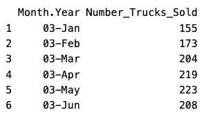
summary(sales_data_input)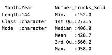
This data has just the information we need – month/year and number of trucks sold. A couple things about times-series – whatever time scale you want to use, it cannot have missing values. Also, you may have noticed that the Month.Year column is a character datatype and only includes the year and month. We’ll need to add a day to the year/month and change the column to a date datatype, if we want the model to recognize we’re using dates and what the time-scale is:
# Load the tidyverse to work with dplyr &
# lubidate to update Month.Year column to date.
library(tidyverse)
library(lubridate)

# Create new dataframe in case we need to rerun
# we won't have to reload the source file.
sales_data <- sales_data_input |>
                    dplyr::mutate(sales_date =
                                as.Date(lubridate::ymd(paste0(Month.Year, '-1')))) |>
                    dplyr::rename(sales = Number_Trucks_Sold) |>
                    dplyr::select(sales_date, sales)

head(sales_data)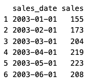
Now we have a dataframe with 144 periods (months) of sales data. However, for time-series, you can’t use a dataframe as is – you need to transform it into a time-series variable. Also, you will need to provide the start date and the frequency. The frequency is typically 12 for monthly, 52 for weekly, etc. In our data, we have a start date of 1/1/2003 and a frequency of 12, since it is monthly:
# There are 144 periods from start = 1/1/2003 to end = 12/1/2014 (by month).
# We can also just use start = 1 and end = 144.
# However, then the model will not know that it is dates.
sales_data_ts <- ts(sales_data$sales, start = c(2003, 1), frequency = 12)
Now I can plot the data so far:
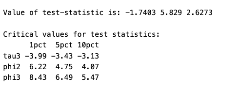
# We can plot the data to see visually what it looks like.
plot(sales_data_ts, xlab = "Month", ylab = "Sales")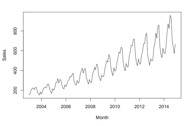
This shows a long-term trend, since the data is moving from the lower part of the graph on the left to the higher part on the right. There appears to be some seasonality as well, from the regular squiggles. The seasonal component is also growing in effect over time.
Unit Roots & the Augmented Dickey-Fuller Test
A unit root is a unit of measurement to help determine whether a time series dataset is stationary. Just looking at the above graph, it is clear that the dataset is not stationary, it is trending up. However, it’s not always this easy. There are statistical methods that calculate a unit root to determine if the dataset is stationary.
One of the most popular methods is using the augmented Dickey-Fuller test. To check for stationarity with the augmented Dickey-Fuller test we’ll use the ur.df() function in the urca package:
library(urca)

adf_test <- ur.df(sales_data_ts, type = 'trend', lags = 12)
summary(adf_test)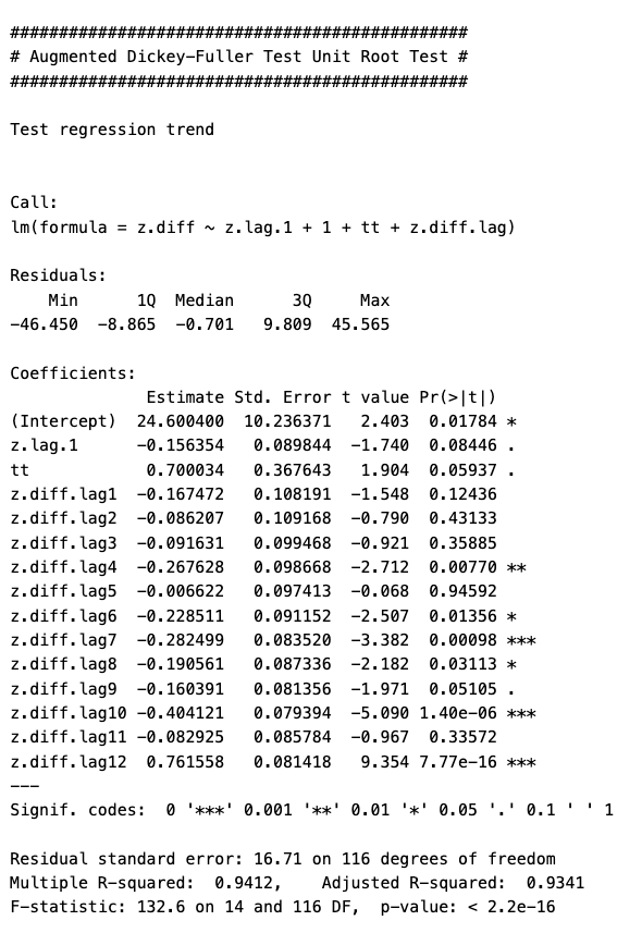
The most important piece of information is the “Value of test-statistic”, which in this case is -1.77403 for level of significance of 1%, 5.829 for a level of significance of 5% and 2.6273 for a level of significance of 10%. To fully reject the NULL hypothesis, these vales should be greater than the tau3 critical values found below the “Value of test-statistic”. In this case, they are all greater than the critical values.
However, using different lags will return different results. For example, using a lag of 1 with this dataset will return test statistics that are less than the critical value at 1%, but greater than the critical values at 5% and 10%. That would lead to a marginal result where you would not be able to fully reject the NULL hypothesis.
Time-Series Decomposition
Now that we have loaded the data, updated it into what we want to work with, transformed it into a time-series object, graphed it, and tested for stationarity, we can now discuss time scales. As you can see from the above graph, there are cyclical things happening on a monthly basis (the sqiggles) as well as on an annual basis (the overall rising squiggly line).
The three types of time scales to think about:
- Long-Term Trend – The long-term direction of the data.
- Seasonality – Fixed intervals of fluxuations within the data.
- Residuals – Unexplained variation in the data not captured by the Long-Term Trend or Seasonality.
Moving Average
We can start with a moving average calculation. The point of a moving average is to understand the long-term trend of the data. We’ll add that as a line against the time-series line we plotted above. A moving average will use a few, consecutive values and average them for a given point.
For example, if we used three consecutive values and the sales were 5, 20, 30 and we centered the calculation around 20, then the moving average value for 20 would be 18.3. If the next value on the time-series after 30 was 56, so the time-series would go 5, 20, 30, 56; then the next moving average value would be for 30 and would average 20, 30, 56. The moving average value for 30 would then be 35.3.
# Load the forecast package.
library(forecast)

# We are going to use five values to calculate the moving average.
ma_data <- forecast::ma(sales_data_ts, order = 5, centre = TRUE)

# Then graph the results.
plot(sales_data_ts, xlab = 'Month', ylab = 'Sales')
lines(ma_data, col = 'Red')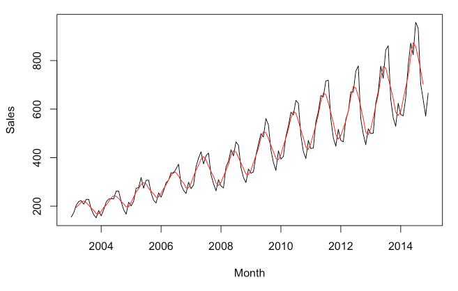
There is obviously very strong seasonal component, but you can see how the MA line has been smoothed compared to the time-series line. Now if we want to just look at the seasonal component, we can plot the time-series divided by the MA (the MA can be subtracted instead, but since the seasonal component is growing over time, division is likely better. This is called the multiplicative approach, as opposed to the additive approach.):
# Seasonal data - multiplicative approach.
seasonal_data <- sales_data_ts / ma_data
plot(seasonal_data, xlab = 'Month', ylab = 'Sales Multiplicative Variation')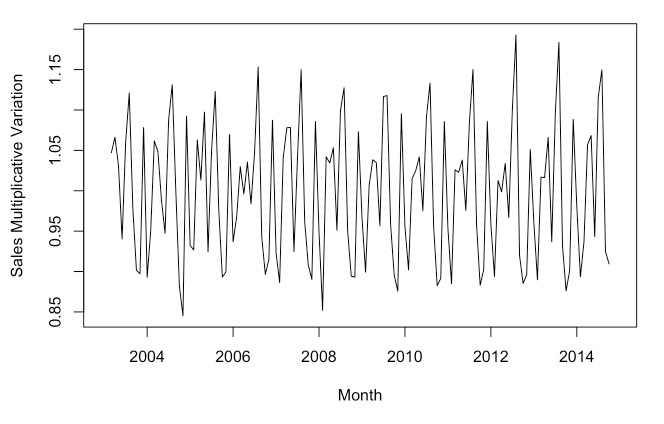
With this graph you can see that the seasonality grows, but it is in proportion to the level of the series. In other words, as the trend turns upward, so does the seasonality.
Now that we have explored the trend and the seasonality, we can use a function to view the time-series, trend, seasonality as well as the residuals:
# We're going to use the multiplicative decomposition.
# However, you can use type = 'additive' to use the additive instead.
sales_data_decomp <- decompose(sales_data_ts, type = 'multiplicative')
plot(sales_data_decomp, xlab = 'Month')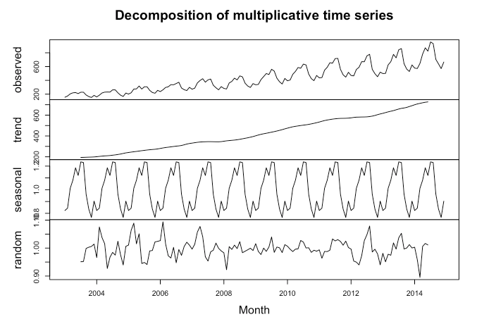
The calculations are done a little differently, but we can see the trend is sloping upwards and the seasonality is consistent in relationship to the trend. Additionally, we can see the random or residuals, which is the variance in the data not explained by the long-term trend or the seasonality.
Autocorrelation & Lags
Autocorrelation is important in time series analysis because it provides insights into the underlying structure and behavior of the data. Positive autocorrelation suggests persistence or trend in the data, while negative autocorrelation suggests alternating patterns. Lack of autocorrelation indicates randomness or white noise. Lags are the number of periods to look back to calculate the autocorrelation.
# Load the stats package.
library(stats)

stats::Box.test(sales_data_ts, lag = 12, type = "Ljung-Box")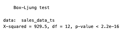
In this data we see clearly there is positive autocorrelation because the X-squared value is positive and the p-value is very small.
We can also look at the data with various lags to see if there are any differences. Differences could indicate that the data is not stationary, that there is seasonality or trending (which we have tested previously).
lag.plot(sales_data_ts, lags = 6, do.line = FALSE)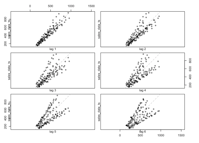
There is definitely a difference between lags. If I expand the look-back window to 24 periods then we can see some annual seasonality, which, given the plot above with the sales spikes, is not surprising:
lag.plot(sales_data_ts, lags = 24, do.line = FALSE)
Autocorrelation Function (ACF)
We can use the ACF to check which lags are significant based on the correlation between a time series and its own lagged values at different time lags. More simply, ACF compares the current period’s value (sales, in this case) with the sales from the prior periods. ACF is useful in identifying white noise (or randomness) and stationarity.
forecast::Acf(sales_data_ts)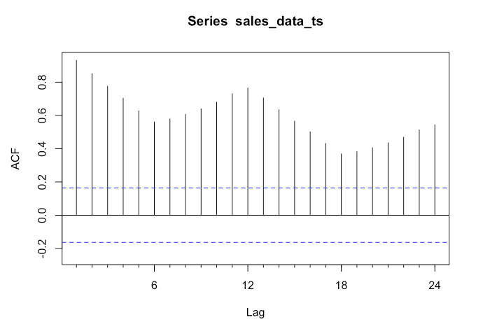
The vertical lines that go above and below the dotted horizontal lines are significant. When none of the vertical lines go above or below the dotted horizontal lines, then the data is likely white noise. If the data is stationary, then the vertical lines would decline to zero rapidly.
If there are trends in the data, the vertical lines would decline slowly and taper off as the lags increase. Finally, if there is seasonality, the vertical lines would go above and below the dotted horizontal lines in a kind of pattern. There can be a mixture of stationary and seasonality in which the vertical lines will both decline slowly and taper off as the lags increase as well as demonstrate a kind of pattern.
In our dummy data, we see that all the lags are significant. We can also see a pattern in the vertical lines, indicating seasonality.
Partial Autocorrelation Function (PACF)
We can use this function to check which lags are significant by identifying the direct relationship between observations at different lags without the influence of the intervening lags. The PACF is more useful than the ACF when building an ARIMA model.
forecast::Pacf(sales_data_ts)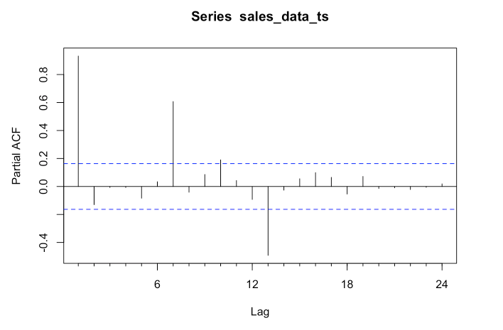
As you can see, there are four significant lags in the data. The lines at 1, 7, 10 & 13 are significant.
Assessing the patterns in both the ACF & PACF can help you to choose an appropriate ARIMA model to use for your data.
The following function pulls together the trend, ACF & PACF in one group chart:
forecast::tsdisplay(sales_data_ts) 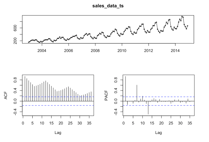
These are basically the steps that I covered it in Pt. 1 (I added a little more detail and did a few things a little differently). Next we are going to fit the model.
Fit the Time-Series ARIMA Model
Use the auto.arima function to automatically select the best ARIMA model for your data based on Akaike Information Criterion (AIC), AICc or BIC value. The function conducts a search over possible model within the order constraints provided. Alternatively, you can manually specify the order of the ARIMA model with forecast::Arima(), but we will not go there in this post.
# Create the auto.arima model first.
arima_model <- forecast::auto.arima(sales_data_ts)

# Use forecast to forecast the data.
forecast_arima <- forecast::forecast(arima_model, h = 24)

# Finally, plot the data.
plot(forecast_arima, xlab = 'Month', ylab = 'Sales')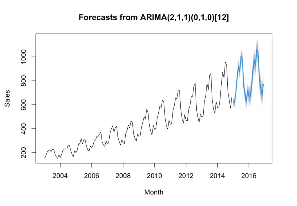
Reaching back to my blog post “Introduction of Time-series Analysis for Digital Analytics”, the notation at the top are the hyperparameters for the series. These are the autoregressive trend order (p), the difference trend order (d), and the moving average trend order (q). The notation would look like this: ARIMA(p,d,q).
Since there is seasonality, there are the seasonal autoregressive order (P), the seasonal difference order (D), the seasonal moving average order (Q) and the number of time steps for a single seasonal period (m). The notation for a seasonal ARIMA (SARIMA) would look like this: SARIMA(p,d,q)(P,D,Q)m.
In this case we have the following:
- p = 2 Auto-regressive trend order of 2
- d = 1 difference trend order of 1
- q = 1 moving average order of 1
- P = 0 No seasonal auto-regressive order
- D = 1 A seasonal difference order of 1
- Q = 0 No seasonal moving average order
- m = 12 time steps for a single seasonal period
Check Time-Series Residuals & Accuracy
Examine the diagnostic plots and statistics of the ARIMA model to assess its adequacy. This step is crucial for verifying that the model assumptions are met and identifying any potential issues. Calculate accuracy measures such as Mean Absolute Error (MAE), Mean Squared Error (MSE), or others to evaluate the accuracy of the forecasts.
Residuals
forecast::checkresiduals(arima_model)
    Ljung-Box test

data:  Residuals from ARIMA(2,1,1)(0,1,0)[12]
Q* = 37.291, df = 21, p-value = 0.01558

Model df: 3.   Total lags used: 24
The residuals from the checkresiduals() plot should look like white noise. It should not have any systematic pattern to it. The histogram and density plots of the residuals should follow a normal distribution. The ACF should not show any significant vertical lines. If there are some, then there still information that the model has not captured, which looks the case for our model since there are two vertical lines that appear significant.
Additionally, a Ljung-Box test is run to determine whether the autocorrelations of the residuals at different lags are statistically significant. With a p-value of 0.01558, it appears that there exists some autocorrelation in the residuals and more work could be done to better the model.
Accuracy
forecast::accuracy(forecast_arima) ME RMSE MAE MPE MAPE MASE
Training set 2.176789 17.61612 12.83449 0.3775811 2.966608 0.261807
ACF1
Training set -0.002502738This is what each value means:
The mean error (ME) is the average of the forecast errors – the residuals – calculated as the difference between the observed values and the forecast values. In this case our forecast is slightly high.
The root mean squared error (RMSE) is a measure of the average magnitude of the forecast errors and is expressed in the same units as the data. In this case, the average sales for the dataset is approximately 428 and the RMSE is 17.6 units above – about 4% off.
The mean absolute error (MAE) is the average of the absolute forecast errors. The lower, the better.
The mean percentage error (MPE) is the average of the percentage errors, calculated as the difference between the observed values and the forecasts divided by the observed values, multiplied by 100.
The mean absolute percentage error (MAPE) is the average of the absolute percentage errors. MAPE provides a measure of the average magnitude of the percentage errors, regardless of their direction.
The mean absolute scaled error (MASE) compares the forecast accuracy of a model to the forecast accuracy of a naive forecast (e.g., the random walk model).
And finally, ACF1 is the autocorrelation of the residuals at lag 1. It provides a measure of the correlation between consecutive residuals. In this case it is very low at -0.0025.
Summary
When I wrote about doing an ARIMA model in BigQuery (Introduction to Time-Series –> https://rebrand.ly/z4lomwu), it was simply to get the model up and running using BigQueryML and a machine learning model. I didn’t get into the details of what you should know about your data.
In this post we did the following steps:
- Plotted the time-series
- Tested for unit roots
- Decomposed the time-series to understand the long-term trend, seasonality and residuals
- Calculated a moving average
- Calculated the seasonal component
- Created a multiplicative decomposition graph
- Reviewed autocorrelation and lags
- Ran the ACF & PACF functions
- Fit the ARIMA model with auto.arima()
- And finally, checked residuals & accuracy of the model
These step will help you to understand your data better and how accurate your ARIMA model is fitting as well as whether an ARIMA model is the appropriate model for the data you are trying to fit.