Introduction
Retrieving the Time-Series Data
The first step is to load some data to work with. I am going to pull the same data I used in a previous post on ARIMA models that is from BigQuery public datasets. I’ll use the bigrquery package to connect to BigQuery:
library(bigrquery)Then I am going to authenticate to a GCP project and create a function that I can use to open and close a connection to a BigQuery dataset and retrieve the data from a query sent to BigQuery to run:
# Set the path to the authorization json downloaded from GCP or
# an email address that has access to a GCP project:
# bigrquery::bq_auth(email = 'yo*@****co.com', path = "gcp_authentication.json")
# Create function to open a connection to BigQuery.
sqlQuery <- function (query) {
  con <- DBI::dbConnect(bigrquery::bigquery(),
project = time_series # The GCP project
  )
# Close db connection after function call exits.
on.exit(DBI::dbDisconnect(con))
# Send Query to obtain result set.
  result <- as.data.frame(DBI::dbGetQuery(con, query))
# Return the dataframe
return(result)
}
Now that the connection to BigQuery is setup, we can pass a query to retrieve the data:
# Get Google Analytics data.
# This is from the public dataset in BigQuery.
# The query has been written for our time-series analysis.
db_query <-
"SELECT CAST(event_date AS DATE FORMAT 'YYYYMMDD') AS order_date,
        items.item_name  AS item_name,
        IFNULL(SUM(ecommerce.purchase_revenue), 0) AS revenue
FROM    `bigquery-public-data.ga4_obfuscated_sample_ecommerce.events_*`, unnest(items) as items
WHERE   event_name = 'purchase'
        AND items.item_name IN ('Google Zip Hoodie F/C',
                                'Google Crewneck Sweatshirt Navy',
                                'Google Badge Heavyweight Pullover Black')
GROUP BY order_date,
         items.item_name
HAVING  order_date BETWEEN DATE('2020-11-01') AND DATE('2021-01-31')
         -- AVOID hard coding dates (except in this example) - order_date BETWEEN CURRENT_DATE() - 365 AND  CURRENT_DATE() - 1
ORDER BY order_date;"
# This will call the function that will open a connection to BigQuery,
# send the query string, retrieve the data & close the connection.
ga_data <- sqlQuery(db_query)
Exploring the Time-Series Data
Let’s take a peak at the data I pulled from BigQuery:
head(ga_data) order_date item_name revenue
1 2020-11-02 Google Zip Hoodie F/C 956
2 2020-11-03 Google Zip Hoodie F/C 1390
3 2020-11-04 Google Zip Hoodie F/C 568
4 2020-11-05 Google Badge Heavyweight Pullover Black 46
5 2020-11-05 Google Zip Hoodie F/C 120
6 2020-11-06 Google Zip Hoodie F/C 577summary(ga_data) order_date item_name revenue
Min. :2020-11-02 Length:180 Min. : 44.0
1st Qu.:2020-11-22 Class :character 1st Qu.: 104.0
Median :2020-12-08 Mode :character Median : 316.5
Mean :2020-12-10 Mean : 482.6
3rd Qu.:2020-12-26 3rd Qu.: 619.5
Max. :2021-01-25 Max. :3644.0 This data has sales for three items over the the period from November 2nd, 2020 to January 25th, 2021. This is a small sample, but it’ll do for our purposes. To make it even simpler to work with, I’m going to pare it down to just the date and revenue:
# Load the tidyverse to work with dplyr.
library(tidyverse)
# Start with univariate data - aggregate by day.
ga_data_univariate <- ga_data |>
                        dplyr::group_by(order_date) |>
                        dplyr::summarize(revenue = sum(revenue)) |>
                        dplyr::ungroup()
ga_data_univariate
# A tibble: 79 × 2
order_date revenue
<date> <dbl>
1 2020-11-02 956
2 2020-11-03 1390
3 2020-11-04 568
4 2020-11-05 166
5 2020-11-06 577
6 2020-11-07 562
7 2020-11-08 372
8 2020-11-09 64
9 2020-11-10 832
10 2020-11-11 846
# ℹ 69 more rowsFor time-series, you can’t use a dataframe as is – you need to transform it into a time-series variable. In this case we are using all 79 days and each day is going to be a value in the time-series model:
# With this data, we are looking at it on a daily basis (we don't have a lot of data).
# We are using all the dates in the data - 79 days.
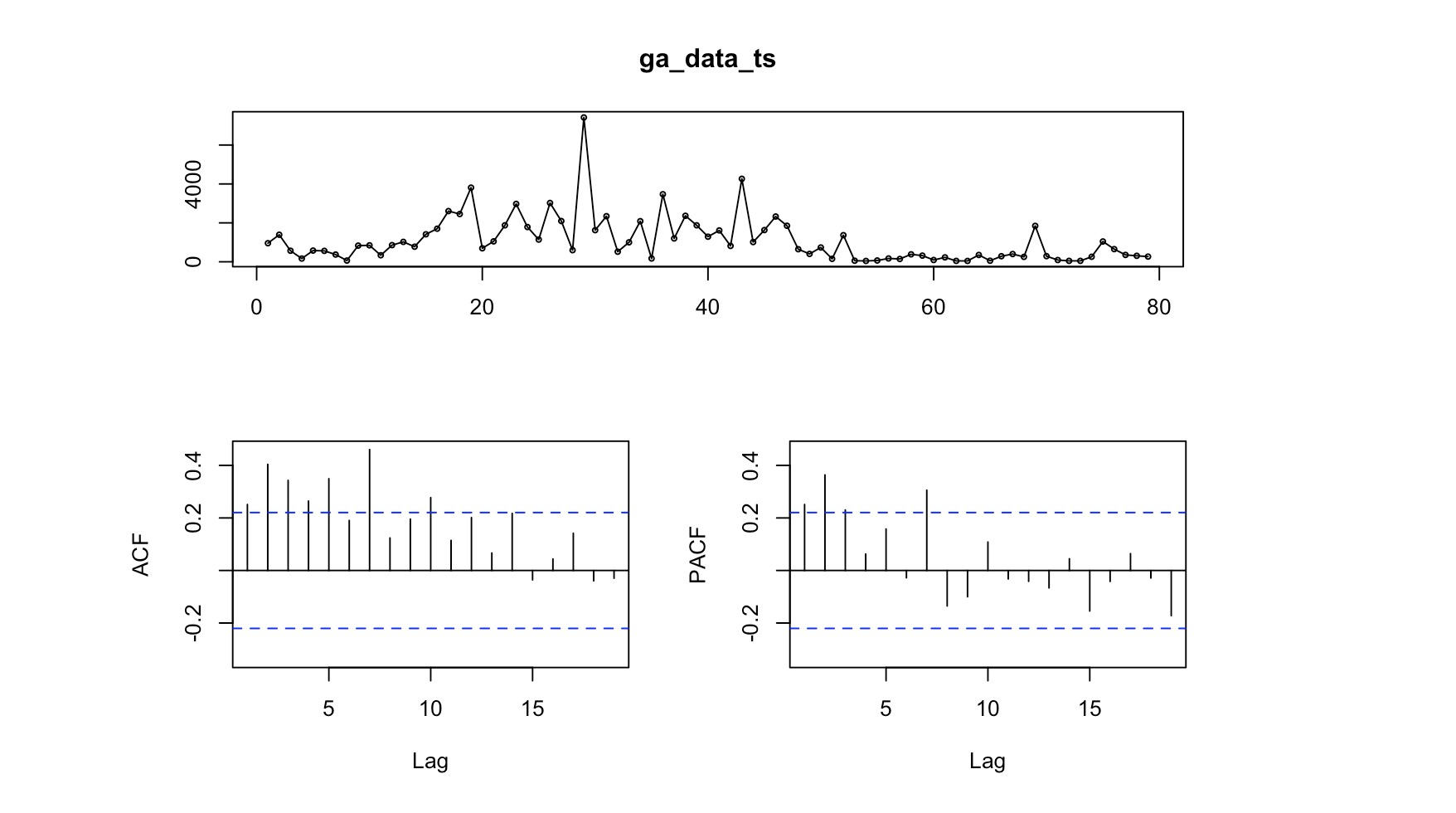
ga_data_ts <- ts(ga_data_univariate$revenue, start = 1, end = 79, frequency = 1)Now I can plot the data and add a line to show the smoothed trend:
# We can plot the data to see visually what it looks like.
plot(ga_data_ts, xlab = "Day", ylab = "Revenue")
# And we can add a line to smooth the results.
lines(stats::lowess(ga_data_ts), col = 'red')
# We can also look at the data with various lags -
# looking back 1 through 12 periods (days) to see
# if there is any difference.
lag.plot(ga_data_ts, lags = 12, do.line = FALSE)
Autocorrelation Function (ACF)
We can use the ACF to check which lags are significant based on the correlation between a time series and its own lagged values at different time lags. More simply, ACF compares the current day’s value (revenue, in this case) with the value from yesterday. It also compares yesterday’s value compared to the day before as well as the current day’s value compared to the day before last’s value.
ACF is useful in identifying white noise (or randomness) and stationarity.
forecast::Acf(ga_data_ts)
The vertical lines that go above and below the dotted horizontal lines are significant. In this case we see a number of significant lines. If the data was white noise, then none of the vertical lines would go above or below the dotted horizontal lines. If the data is stationary, then the vertical lines would decline to zero rapidly.
If there are trends in the data, the vertical lines would decline slowly and taper off as the lags increase. Finally, if there is seasonality, the vertical lines would go above and below the dotted horizontal lines in a kind of pattern. There can be a mixture of stationary and seasonality in which the vertical lines will both decline slowly and taper off as the lags increase as well as demonstrate a kind of pattern.
Partial Autocorrelation Function (PACF)
We can use this function to check which lags are significant by identifying the direct relationship between observations at different lags without the influence of the intervening lags. The PACF is more useful than the ACF when building an ARIMA model.
forecast::Pacf(ga_data_ts)
As you can see, there are a couple of significant lags in the data. Assessing the patterns in both the ACF & PACF can help you to choose an appropriate ARIMA model to use for your data.
The following function pulls together the trend, ACF & PACF in one group chart:
forecast::tsdisplay(ga_data_ts) 
Time-Series Conclusion (for now)
This is a first step in creating an ARIMA model. I really like exploring the data before getting into modeling it. For the ARIMA model in BigQueryML, I just jumped right in. I think this way is better – more taunting, I admit, but it gives you a better understanding of the data and allows you time to explore and shape the data before building a model. I also feel, for that reason, I have to break it out into a couple of posts.