Let’s say you want to forecast future revenue. You could fill in a month-to-month or week-to-week spreadsheet template. However, these are very subjective methods of trying to predict the future and often wildly inaccurate.
A better method would be to create predictive models using time series analysis. Time series predictive models are a specific subset of statistical models that deal with data that are ordered by and dependent on time. On a graph, the x-axis would be time, with the y-axis the thing (revenue, in this case) you are measuring.
In this post, I will give an overview of one type of time series models and describe how they work in simple language. I will describe how to implement the models in BigQuery ML.
In time series models, the y-axis values are compared to other values on the y-axis (the lag values). For example, this month’s revenue is compared to last month’s revenue and the revenue of the month before, going all the way back to the beginning of the dataset. The chosen comparisons are based on the statistically significant lags. Last month’s revenue might be statistically significant to the current month’s revenue, but revenue two months ago may not be (but revenue from three months ago might be, etc.).
ARIMA Models
The acronym ARIMA stands for auto-regressive (AR) integrated (I) moving-average (MA). ARIMA models can be broken down into AR models, and MA models. It can also be pulled together as ARMA models, without the integration (I).
ARIMA models are a subset of predictive analytics, but different compared to linear regression models, because of time as the x-axis. However, like linear regression models, the y-axis has to be values that can be aggregated, as opposed to classification models, where the y-axis cannot be aggregated.
Examples of y-axis values that can be aggregated are revenue, visitors, or email subscribers. An example of values in a classification model would be what percentage of visitors are from a given traffic source. In that case, the y-axis would be traffic sources. Just to make it clearer between the two, in a time series model you would like to know how revenue changes over time; in a classification model you would like to know how the traffic source mix changes over time. An ARIMA model works if you would like to know how revenue changes over time. It does not work if you would like to know how the traffic source mix changes over time.
There are machine learning packages for ARIMA models and they can do the bulk of the work for you. However, you should understand the basics of the models because it will help you to understand and statistically describe the underlying data (for example, is there white noise or seasonality in the data).
Stationarity
The first step in using an ARIMA model is to check if the data is stationary. Stationary processes are easier to analyze than non-stationary processes. A stationary process looks flat over time with no discernible trend. Statistically, a stationary process has a constant mean and variance (or standard deviation) and no seasonality.
It is likely that most of the time series datasets that we would be interested in, like revenue by month, would not be stationary. What do we do? We have to use a statistical method to transform the data into a stationary process.
One statistical method to transform the data is called differencing. Differencing is the process of taking the value for this time period and subtracting the value from a previous time period (the lag value). Using the difference will create a more stationary process as the outcome.
For example, if we’re looking at revenue by month, then subtracting last month from this month would give you the value that you would plot. If revenue last month was £80K and this month is £100K, then the difference is £20K. Let’s say that the next month is again £80K. Then the value that you would plot would be -£20K.
If you were to plot the above, you would likely find that the mean would be the same, regardless if you took just a section (local) or the entire dataset (global).
There are other methods to achieve stationarity, like using the rolling mean or transformations like the log or square root.
Unit Roots
A unit root is a unit of measurement to help determine whether a time series dataset is stationary. In the discussion above on stationarity, I described a stationary process and how to solve the issue of non-stationarity. However, it can be difficult to determine if a dataset is stationary in the first place.
If a unit root equals 1, the dataset has a unit root and is not stationary. If it is less than 1, then it is likely stationary – it does not have a unit root. However, if a unit root is greater than 1, then it has an explosive root. Explosive roots are rare and usually unrealistic. So if you have an explosive root, you probably have other issues with your data. We are then left with addressing only the unit root case.
Augmented Dickey-Fuller Test
The next question regarding unit roots is how do you calculate them. One of the most popular methods is using the augmented Dickey-Fuller test. This expands on the original Dickey-Fuller test by including more differencing terms – the difference between last period and this period, period before last and this period, the period before that and this period, etc.
An augmented Dickey-Fuller test (ADF) uses hypothesis testing to determine if a unit root is present. It begins with the assumption that there is a unit root in the dataset (the null hypothesis) – that the test will produce a 1. In that case, the null hypothesis is not rejected and it is determined that there is a unit root. If the test produces anything other than a 1, the null hypothesis is rejected and it is determined that there is not a unit root. Of course, there is the confidence interval and p-value to keep in mind as with any hypothesis testing.
White Noise & Seasonality
Other than unit roots, white noise and seasonality can also impact time series models. Even if you are not interested in forecasting, wouldn’t it be great to know that your dataset has seasonality or white noise and have tools to check for these, instead of just eye-balling a graph. For time series modeling, it’s critical to know if either of these exist in your dataset.
White noise time series are ones where there is no correlation between the current value and the lagged values. That means that none of the lagged values help in predicting the current value. The autocorrelation function in a white noise time series will return a value close to zero.
Seasonality occurs in a dataset when there is a fixed and known pattern to the data. This usually occurs due to time of year or day of the week. A time series decomposition function can be used to measure whether there is seasonality and how strong the seasonality is.
ACF
The Autocorrelation Function (ACF) and Partial Autocorrelation Function (PACF) help in understanding the relevance of lags (values in past time periods) in AR, MA, and ARMA models. It helps to describe which lags are relevant and which are not.
First, understand that the AR model assumes that the current value is dependent on the previous values, the lagged values. The MA model assumes that the current value is dependent on the errors in the lagged predicted values as well as the error in the current value.
ACF plots the correlation coefficient to determine if the observed values in the series are random (white noise) or correlated. It can describe how correlated the values are to the lagged values and answer whether the times series can be successfully modeled in an MA model.
The correlation coefficient determines how correlated the values are. A -1 means the values have a perfectly negative relationship. Conversely, A +1 means the values have a perfectly positive relationship. A zero means that the values have no correlation at all. For example, when plotted, the value for the current time period has a value of +1 because it is perfectly correlated to itself. Generally, the further back in time the value to the current value, the less correlated it is.
PACF
The PACF plot can answer whether the data can be modeled in an AR model or not. It measures the correlation between a value and each lagged value while controlling for the effects of other lagged values.
For example, for a given current value, we calculate the effects of the previous period, then we calculate the effect of the period before that, while controlling for the effect of that previous period. We are isolating the partial correlation of each lagged value to the current value, removing any effects of other lags that come after that particular lagged value.
AR, MA & ARMA
The AR (Auto Regression) model uses only the lagged values in the dataset. PACF is used to determine which lags over the dataset are statistically significant. Those lags are then used to calculate current and future values.
A MA (Moving Average) model is a little harder to understand. It takes the errors (residuals) of past time series (same dataset) and calculates the present and future values. It is basically forecasting the last period’s value and comparing it to the actual value. That difference is the error. It then weights the present and future values based on the forecasted errors.
An ARMA combines the AR and MA models together. Both the previous lags as well as the residuals are both considered in forecasting present and future values.
ARIMA
With the previous models, you need to first handle stationarity issues. ARIMA models combine the AR & MA, like the ARMA model. However, it handles stationarity issues by adding differencing for non-stationary datasets.
In these models, we need to specify the hyperparameters. These are the autoregressive trend order (p), the difference trend order (d), and the moving average trend order (q). The notation would look like this: ARIMA(p,d,q).
For example, an ARIMA(1,1,1) would contain one AR term, a first differencing term, and one MA term. An ARIMA(2,0,0) would essentially be an AR model with two AR terms and an ARIMA(0,0,2) would essentially be a MA model with two terms.
SARIMA
But what if there is seasonality in the dataset? That is where a seasonal ARIMA (SARIMA) model comes in. A SARIMA model adds four seasonal elements to the three in the ARIMA model. They are the seasonal autoregressive order (P), the seasonal difference order (D), the seasonal moving average order (Q) and the number of time steps for a single seasonal period (m).
The notation for a seasonal ARIMA would look like this: SARIMA(p,d,q)(P,D,Q)m.
Using BigQuery ML to Build an ARIMA Model
To get you started using ARIMA models, I’m going to show you how you can use BigQuery ML to build one and display it in Google Looker Studio. This will be a simple example.
The first step in using BigQuery ML is to retrieve a dataset and pre-process it into the correct format. Since I do a lot of work with Google Analytics and GA data is now easy to flow into BigQuery, I am going to use a GA dataset. However, since most GA datasets are not open to the public, I am going to have to find one I can use and share publicly.
Retrieving the Dataset
One of the awesome things about BigQuery is that Google has made numerous datasets publicly available. One of those datasets is a copy of some data from the Google Store’s GA feed into BigQuery. To check out this dataset, just run the following query:
SELECT *
FROM `bigquery-public-data.ga4_obfuscated_sample_ecommerce.events_*`
LIMIT 100;
If you have been uploading your GA data into BigQuery, the query results should look familiar. Each line is an event, with the date of the event (event_date), event timestamp (event_timestamp) and event name (event_name). There are also nested event parameters (event_params.key) and their string vale (event_params.vale.string_value).
We only want the “purchase” events and we are going to analyze the sales of the following three items:
- Google Zip Hoodie F/C
- Google Crewneck Sweatshirt Navy
- Google Badge Heavyweight Pullover Black
We also are going to limit the time period, so we can use the data to predict future sales. In this case, we are going to analyze sales between 11/1/2020 and 1/31/2021. We will then forecast sales for February 2021.
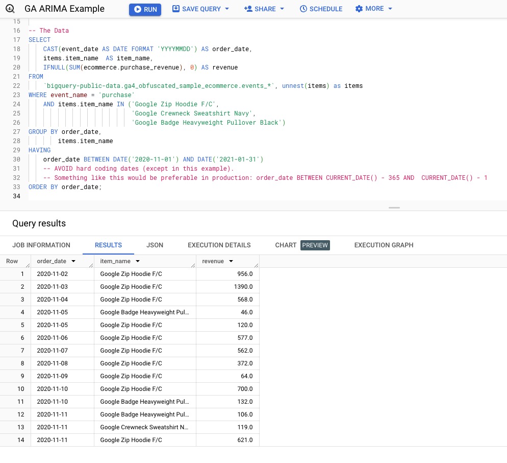
Here is the query to retrieve our data:
SELECT
    CAST(event_date AS DATE FORMAT 'YYYYMMDD') AS order_date,
    items.item_name  AS item_name,
    IFNULL(SUM(ecommerce.purchase_revenue), 0) AS revenue
FROM
    `bigquery-public-data.ga4_obfuscated_sample_ecommerce.events_*`, unnest(items) as items
WHERE event_name = 'purchase'
    AND items.item_name IN ('Google Zip Hoodie F/C',
                            'Google Crewneck Sweatshirt Navy',
                            'Google Badge Heavyweight Pullover Black')
GROUP BY order_date,
        items.item_name
HAVING
    order_date BETWEEN DATE('2020-11-01') AND DATE('2021-01-31')
    -- AVOID hard coding dates (except in this example).
    -- Something like this would be preferable in production: order_date BETWEEN CURRENT_DATE() - 365 AND  CURRENT_DATE() - 1
ORDER BY order_date;
This query unnests items, groups by each item and the sale date and sums the revenue for the items and time period we want to analyze. If you run this query, you should see the following:
Creating the ARIMA Model
Now that we have our data, we can create the ARIMA model. To do that we need to run a query in BigQuery with the CREATE OR REPLACE MODEL with our model name, options and include the query above. The OPTIONS function is used to describe what type of model. These are the options we will need in our model:
- MODEL_TYPE is the type of model we want to use, in this case it is ARIMA_PLUS.
- TIME_SERIES_TIMESTAMP_COL is the date column in our data, which is order_date from our query.
- TIME_SERIES_DATA_COL is the value we want to forecast, which is the revenue column from our query.
- TIME_SERIES_ID_COL is the items that we want to forecast, which is the item_name column in our data.
- HOLIDAY_REGION is to help with seasonality and we will use the US holiday schedule.
When we put it all together it looks like this:
CREATE OR REPLACE MODEL sample_data.ga_arima_model
OPTIONS(
MODEL_TYPE='ARIMA_PLUS',
TIME_SERIES_TIMESTAMP_COL='order_date',
TIME_SERIES_DATA_COL='revenue',
TIME_SERIES_ID_COL='item_name',
HOLIDAY_REGION='US'
) AS
SELECT
order_date,
item_name,
revenue
FROM
(SELECT
CAST(event_date AS DATE FORMAT 'YYYYMMDD') AS order_date,
items.item_name AS item_name, --item_name is a nested dimension, so must be unnested.
IFNULL(SUM(ecommerce.purchase_revenue), 0) AS revenue -- purchase_revenue is not a nested metric, so does not have to be unnested.
FROM
`bigquery-public-data.ga4_obfuscated_sample_ecommerce.events_*`, unnest(items) as items -- unnesting items.
WHERE event_name = 'purchase'
AND items.item_name IN ('Google Zip Hoodie F/C',
'Google Crewneck Sweatshirt Navy',
'Google Badge Heavyweight Pullover Black')
GROUP BY order_date,
items.item_name
HAVING
order_date BETWEEN DATE('2020-11-01') AND DATE('2021-01-31')-- order_date BETWEEN START 2 MONTHS AGO AND END LAST MONTH
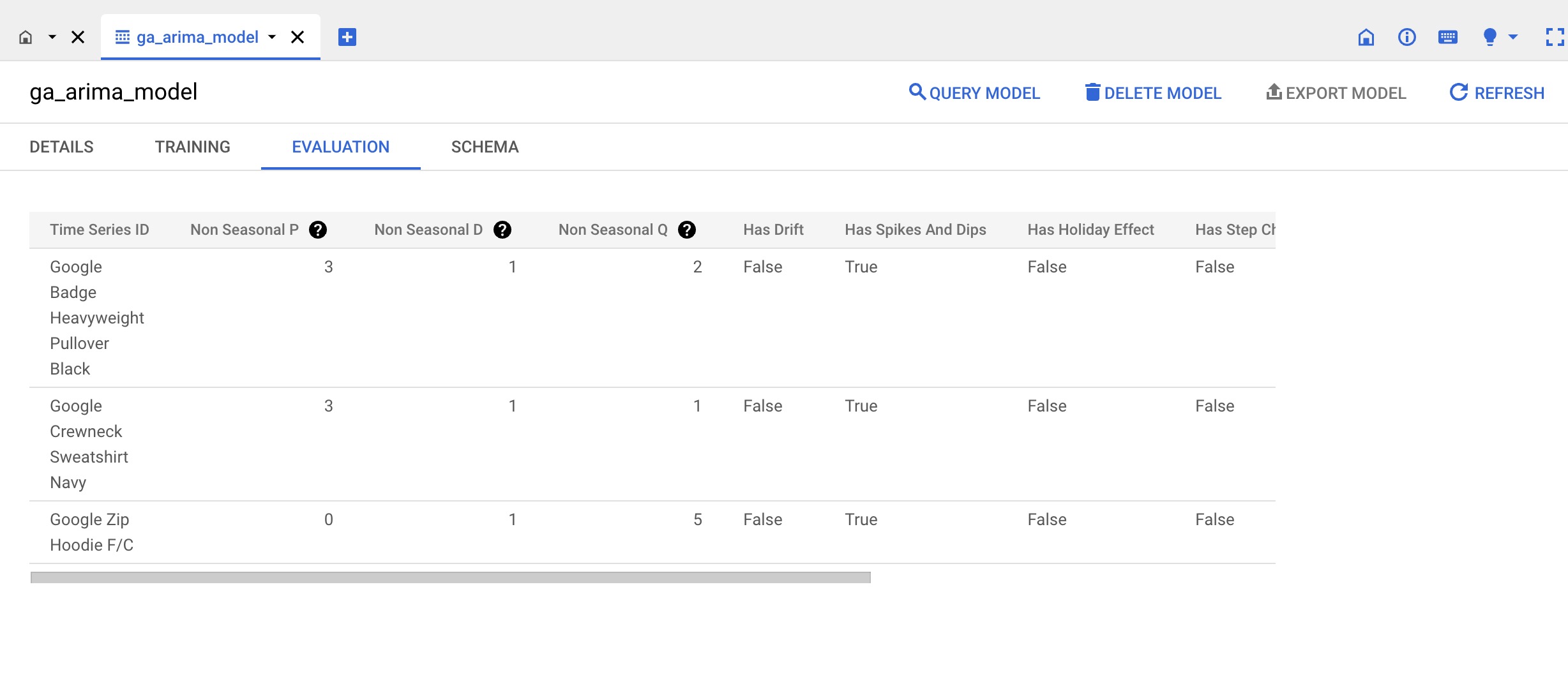
ORDER BY order_date)ga;When the model has been created (in this case, it should take about a minute), there will be a blue button in the bottom right corner to go to the model. Click on the button and you will see ga_arima_model at the top. click on EVALUATION and you should see the following: 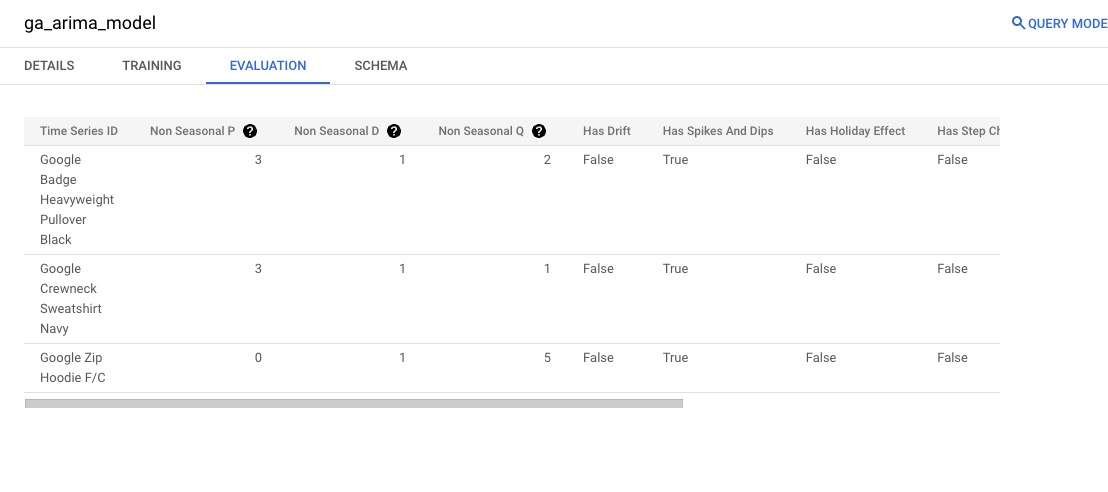
Evaluating the Model
This will give you information about the model. Besides the item (Time Series ID), there are seven other columns. This is what each column represents:
- Non Seasonal P: The number of autoregressive terms – number of time lags.
- Non Seasonal D: The number of nonseasonal differences needed for stationarity – the number of times the data have had past values subtracted.
- Non Seasonal Q: The number of lagged forecast errors in the prediction equation.
- Has Drift: If TRUE, that means the model fit fluctuates around a trend.
- Has Spikes And Dips: If TRUE, it can be indicative of various issues with the data. In the case of our data, it does have some issues, likely due to the narrow timeframe. In practice, it would likely be better to have wider timeframe of data.
- Has Holiday Effect: If TRUE, then holidays have a statistically significant effect on the data.
- Has Step Changes: If TRUE, there may be variations in the model’s performance across different threshold values or dataset characteristics.
- Log Likelihood: The log-likelihood value for a given model can range from negative infinity to positive infinity. The actual log-likelihood value for a given model is mostly meaningless, but it’s useful for comparing two or more models. So, if we wanted to compare this model with another, we can use the log-likelihood values to help evaluate the models between each other.
- AIC: AIC stands for Akaike Information Criterion, which estimates the relative amount of information lost by a given model. In simple terms, a lower AIC value is preferred.
- Variance: Variance tells you the degree of spread in your data set.
- Seasonal Periods: What the seasonality of the data is.
Another way to navigate to this information is to run the following statement:
SELECT
  *
FROM
  ML.EVALUATE(MODEL sample_data.ga_arima_model);
If you want to see the coefficients for AR, MA and I in the model, you can run the following statement:
SELECT
 *
FROM
 ML.ARIMA_COEFFICIENTS(MODEL sample_data.ga_arima_model);
Creating the Model View
We will next create a view with the forecast values in it which we will be able to use. To create this view, run the following code:
CREATE OR REPLACE VIEW sample_data.ga_arima_model_pred AS

SELECT
    *
FROM
    ML.FORECAST(MODEL sample_data.ga_arima_model,
                STRUCT(30 AS horizon,
                        0.90 AS confidence_level));
If you query this view, you should see the following (note that even though we chose dates between 11/1/2020 & 1/31/2021, there are forecast dates beginning in January. That is because the end of January data is 1/25/21. In fact, that is the end of all the data in the original dataset – it’s a very small sample.):
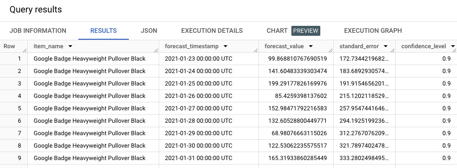
There are four additional columns giving the prediction & confidence intervals lower and upper bounds. We have set the confidence level at 0.90 and the time horizon as 30 days.
Connecting BigQuery View to Data Studio
To give an example of how to use this data, we can pull this view into Google Data Studio by connecting Data Studio to BigQuery and creating a simple, custom query:
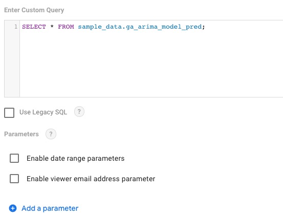
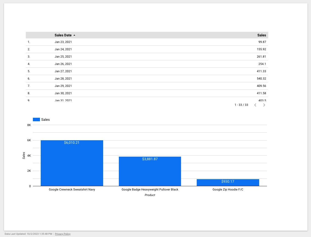
Once the view is connected to Looker Studio, you can create a report based on the view. Here is a simple report from Looker Studio:
In production, you would need to update the model and the view on a regular basis. This is not as difficult as you may think. There are fairly straight forward ways to do this in BigQuery. Also, keep in mind that the further out you try to predict, the more variability there will be.
Conclusion
This post provides a general overview of ARIMA models and how to build a simple one with BigQuery ML. I hope this has given you a start on how to begin to create your own time series models. Time series models can be very useful, but there are some things to consider when using them (like white noise, seasonality, etc.).
If you want to go deeper into ARIMA models and other time series models, check out this playlist by ritvikmath.
P.S. If you are unfamiliar with BigQuery, check out this post.